5 Meta Video Ad Examples for Web Apps: Turn Screen Recordings into Ads
If your web app screen recording feels like a feature walkthrough, start by changing the opening scene and the order of your explanation. These five hypothetical examples help you choose an ad structure that fits the footage you have.
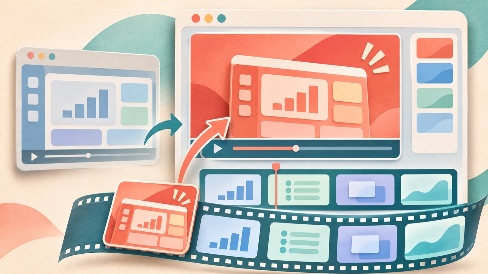
If you are looking for Meta video ad examples for web apps, try structuring your video around the customer's workflow instead of your menu order. A problem-solving ad starts with a frustrating situation, a completed-task ad starts with the finished result, and a feature-focused ad starts with the moment something changes on screen. Production requests in Korea also show workflows that use screen recordings, selling points, and reference ads.1 All five examples below are hypothetical. They cover how to choose an opening scene and a sequence for the Korean explanation that fit your available assets, then turn them into an ad draft in AdForge.
1. Problem-led: Are revision requests scattered across tabs?
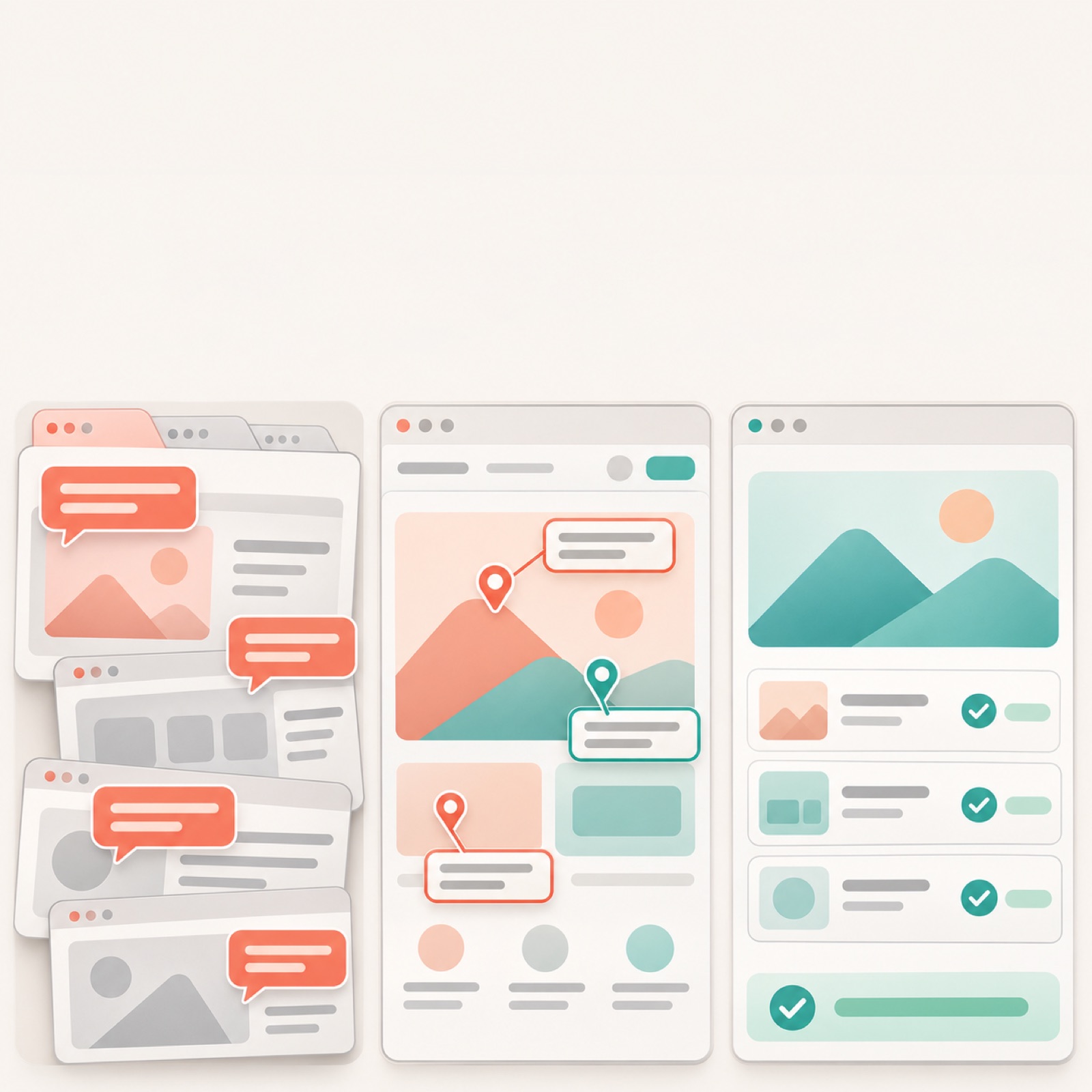
This hypothetical example features a design review web app. The opening scene shows revision requests for the same design scattered across different browser tabs. The text at the top reads, “Which tab has the final revisions?” Next, show someone opening the design in the actual app, leaving feedback at the relevant location, and checking requests that have been addressed. Close with “Start your review with a single design.” Connecting the frustration and its resolution within the same task makes the app's purpose easy to understand, even without knowing its feature names.
To adapt this to your own app, pair one moment where customers get stuck with the screen that resolves it. Do not include feedback consolidation or automated processing that the app does not actually support. In AdForge, choose a reference ad that shows the problem first, then add your own recording and the selling point “Review feedback by location on the design.” Check the generated script and storyboard to make sure the solution screen follows the problem. If recording the entire browser has made the comments too small, replace the footage with a recording that clearly shows the relevant area.
2. Completed-task: Show the finished report first
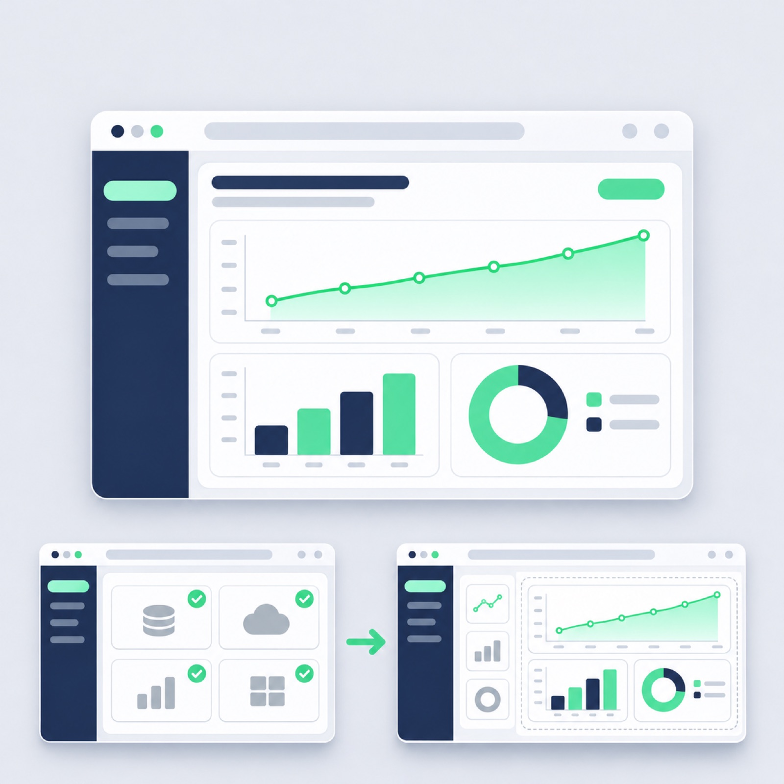
This hypothetical example features a report-writing web app. The opening scene shows a completed weekly report instead of an empty dashboard. Display the report prominently in the center of the screen with the text “Bring this week's report together on this screen.” Then return to the data selection screen and show the process of organizing the items and checking the finished report. Use the same data and report items in the before-and-after views so the change is clear. Showing the result first gives the clicks that follow a purpose. Do not include figures for time saved unless you have measurement data.
This structure works well for apps with clear deliverables, such as quotes, booking schedules, or proposals. To adapt it to your product, substitute the output customers receive and the actual steps used to create it. In AdForge, select a reference ad that shows the result first, then upload a screenshot of the finished output and a recording of the process. Write the script around actions you can show on screen, such as “Choose your data, organize the items, and check your report.” Review whether the opening scene and the final output are consistent, and whether omitting any required steps makes the process look simpler than it actually is.
3. Feature-focused: The moment you spot overlapping bookings
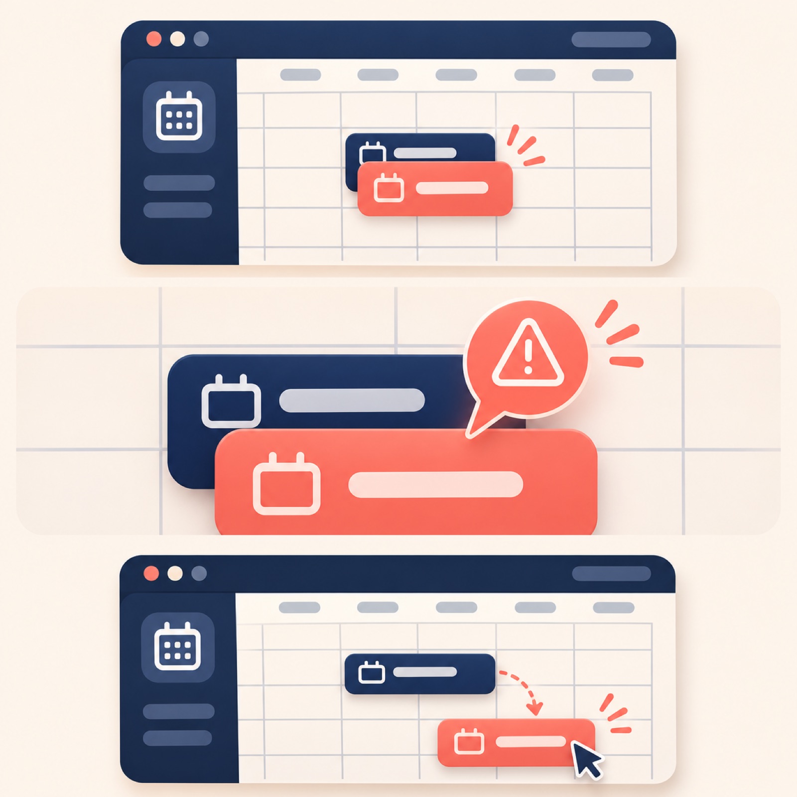
This hypothetical example features a booking management web app. The opening screen prominently displays two bookings with overlapping times and asks, “Where's the booking conflict?” In the next scene, show the actual app's conflict indicator, followed by a staff member opening the booking details and adjusting the time. The closing text reads, “See your bookings at a glance.” Focus on the sequence of spotting an indicator and taking action, without touring multiple menus. This structure communicates exactly what customers can see and what they can do.
This approach suits apps with a distinctive feature whose full overview videos tend to run long. For your product, choose one feature with a visible change, such as narrowing search results, checking differences between documents, or finding an order's status. Add before-and-after recordings of that feature and its selling point to AdForge, then remove explanations of other features from the generated Korean script. Revise the storyboard so the click target leads directly to the changed result. If the key indicator is hard to see in the finished video, you can regenerate just that scene. Also check that the narration has not added an automatic resolution feature that is absent from the screen.
4. Usage scenario: Find the decisions just before a meeting
This hypothetical example features a meeting notes web app. The opening scene shows notes from a previous meeting with the text “Before your next meeting, find the previous decisions.” Then show the sequence of searching for a project, opening the relevant notes, and checking decisions and assigned tasks. End with “Check your past notes for what to do next.” Text and a browser workflow can establish the usage scenario without scenes featuring actors. The aim is to help customers understand when to open the app. Only describe automatic summarization if the app actually supports it.
For your own app, change the trigger to something like “Before month-end reconciliation” or “Before replying to a customer inquiry.” Discussions about producing SaaS videos also raise questions about the burden of outsourcing and the process of making videos yourself.2 In AdForge, choose a reference ad that briefly establishes the situation, then upload an actual recording covering the steps from searching to checking the information. In the message, specify the usage scenario and the information the user should find at the end. A separate post requesting a tool raised concerns about choppy voices in generated videos.3 During production review, listen for natural pronunciation of feature names and separately check that the explanation matches the screen being shown.
5. Getting started: Create just one project
This hypothetical example features a project management web app. The opening scene shows the new project screen with the text “New here? Start with one project.” The sequence continues with entering a sample project name, adding the first task, assigning an owner, and checking the list. End with the prompt “Try adding your first task.” This structure shows the screen users will reach after getting started, rather than listing features. Choose it when you want to explain the first-use workflow. If there are additional signup or setup steps, state the demo's starting conditions in the text with wording such as “After creating a project.”
In AdForge, first find and save reference ads that show the getting-started process in the Meta and TikTok ad libraries, then review the hook, cut, and caption analysis. Choose the ad to remake, add your product information and the message “Add tasks to your first project,” and upload your prepared screenshots and screen recordings. Check and revise the Korean script and storyboard so the scenes match the actual sequence of actions. Review the result, which includes AI narration, word-level captions, and background music, then regenerate any scenes that need work and download the video. Video production is paid, and you also need to check your rights to use the uploaded assets. Submit and run your Meta ads, and check their performance, directly in your existing ad management tools.
Key takeaways
Choose a problem-led format when the problem is clear, a completed-task format when there is a clear deliverable, and a feature-focused format when a feature produces an obvious change. A usage-scenario ad shows what prompts someone to open the app, while a getting-started ad shows the first action to take. Start by turning one structure you can demonstrate with your actual screens into a Korean ad draft.
FAQ
Which example should I start with if I only have one screen recording?
Start with the completed-task format if you have a finished result, or the feature-focused format if the recording clearly shows a change produced by a specific feature. If it shows the initial steps of using the app, the getting-started format is a good fit. First, choose a message you can demonstrate with the screens you have.
How do I compare problem-led and completed-task ads?
Keep the app, target audience, and landing page the same, and vary the opening scene and the order of the explanation. Upload the creative that starts with the problem screen and the creative that starts with the output as separate ads to help you decide what to produce next. Check performance in your existing ad management tools.
Does AdForge also create new demo screens for web apps?
The demos in this article use actual screenshots and screen recordings prepared by the user. First, prepare assets showing the features and results you want to demonstrate, then review whether the generated video matches how the app actually works.
Can I make Korean video ads for free too?
AdForge offers video ad production on paid plans. Every account's free starting allowance is 12 image ads made with your own product photos. It is not a free allowance for video production.
Related reading
Make your next ad with AdForge
AdForge (ad-forge.io) is an ad remake app: pick an ad you like and rebuild it as a video or image ad for your own product. Find references in the Meta and TikTok ad libraries, let AdForge write the script, AI narration and captions, then review and download. Every account starts with 12 free image ads.