5 Marriage Agency Ad Banner Examples: Counselors, Support, and Upfront Costs
Explore five ways to turn counselor photos and service brochures into Japanese ad banners. Decide whether to lead with a welcoming consultation, the support offered, or upfront costs, then follow the steps to create designs in AdForge.

If you are looking for marriage agency ad banner examples, use counselor photos to convey a welcoming consultation, process cards to explain support, and itemized information to present upfront costs. Rather than emphasizing all three in one banner, build each design around one question people have before booking. All five examples below are hypothetical. They explain exactly where to place your existing counselor and facility photos and verified service descriptions, and how to adapt the Japanese copy.
1. Counselor Introduction
This hypothetical example is for readers who feel uneasy sharing personal matters with someone they have just met. Place a photo of an actual counselor sitting naturally on the right, with 「まずは、あなたのお話から。」 on the left. Use dark brown text on an ivory background, and include only the counselor’s verified name and role below the photo. Use 「相談を予約する」 as the call to action, linking to consultation booking.
This layout first shows people whom they will meet during a consultation. An actual social media ad production brief specified the target audience, selling point, portrait photo, and colors together.1 When adapting this approach for your agency, choose a reference layout that suits the direction the person is looking and the available space in your photo. Upload the photo and the counselor’s actual scope of support to AdForge, then check that the face, name, and role in the generated result match the original information.
2. Support Process Overview
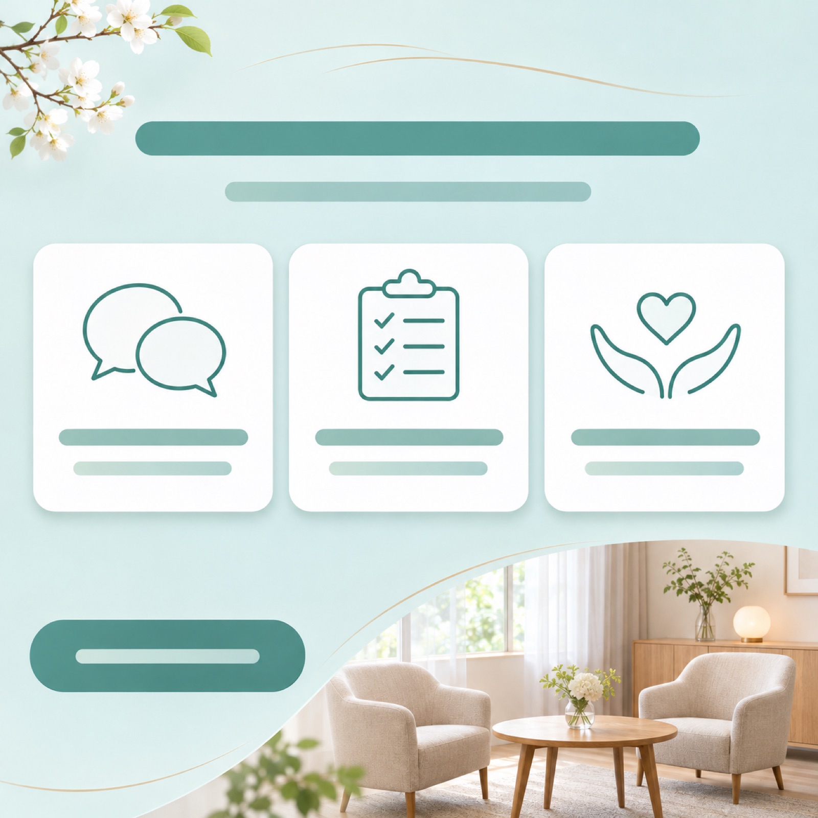
This hypothetical example explains what help members receive after joining. Put 「活動の進め方を、一緒に整理。」 at the top, with three cards arranged horizontally below it representing the initial consultation, preparation for the matchmaking process, and consultations during that process. Separate the information using white cards on a pale teal background, and place a small photo of the consultation space to one side. These three stages are examples, so replace them with the steps and names your service actually uses.
Showing the support process makes it easier to understand what a counselor helps with than an abstract description such as “friendly service.” An actual website banner production brief requested messaging about an approachable start to meeting people and a service that moves at each person’s pace. This is a layout reference, not an example of advertising performance.2 When creating the banner in AdForge, use a card-based layout as your reference and enter only brief descriptions of support confirmed in your service materials.
3. Upfront Cost Overview
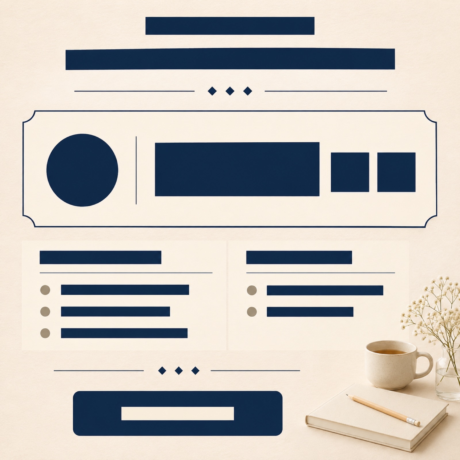
This hypothetical example is for readers who want to know the price but hesitate to make an inquiry first. Put 「入会時にかかる費用をご案内」 at the top and display the actual upfront cost prominently in the center. Immediately below, list what is included and any additional charges, then place 「料金を確認して相談する」 at the bottom. Instead of simply making the number large, this layout helps readers understand what that amount covers when they start.
Use amounts from your agency’s latest fee schedule rather than copying sample figures. Separate the amount payable when joining, monthly fees, and charges that apply under specific conditions, then decide which information to retain on the banner. Enter the verified amounts and applicable conditions together in AdForge, and check that the currency symbols and tax notation have not changed in the result. If the cost explanation is lengthy, keep the upfront cost and key conditions on the banner and show the detailed breakdown on the application screen it links to.
4. Consultation Space Introduction
This hypothetical example is for readers who want to get a feel for the space before visiting. Use an actual consultation room photo for about half the banner, and place 「相談する場所を、先にご紹介。」 in the remaining solid-color area. Choose a photo that shows the distance between the chairs and the table so readers can clearly picture where the conversation will take place. In a separate area at the bottom that does not overlap the photo, place 「来店相談を予約する」 to make the next step—booking an in-person consultation—clear.
The purpose of this layout is to preview what people will see when they visit the agency. Use photos of the actual space, and add descriptions such as a private consultation room or one-on-one consultations only if you have confirmed that they are offered. In AdForge, choose a reference with a large photo area and a separate copy area, then upload your facility photo. If the furniture, entrance, or room layout in the generated result differs from the actual space, do not use it as is; compare it with the original photo before deciding whether to use it.
5. Service Brochure Introduction
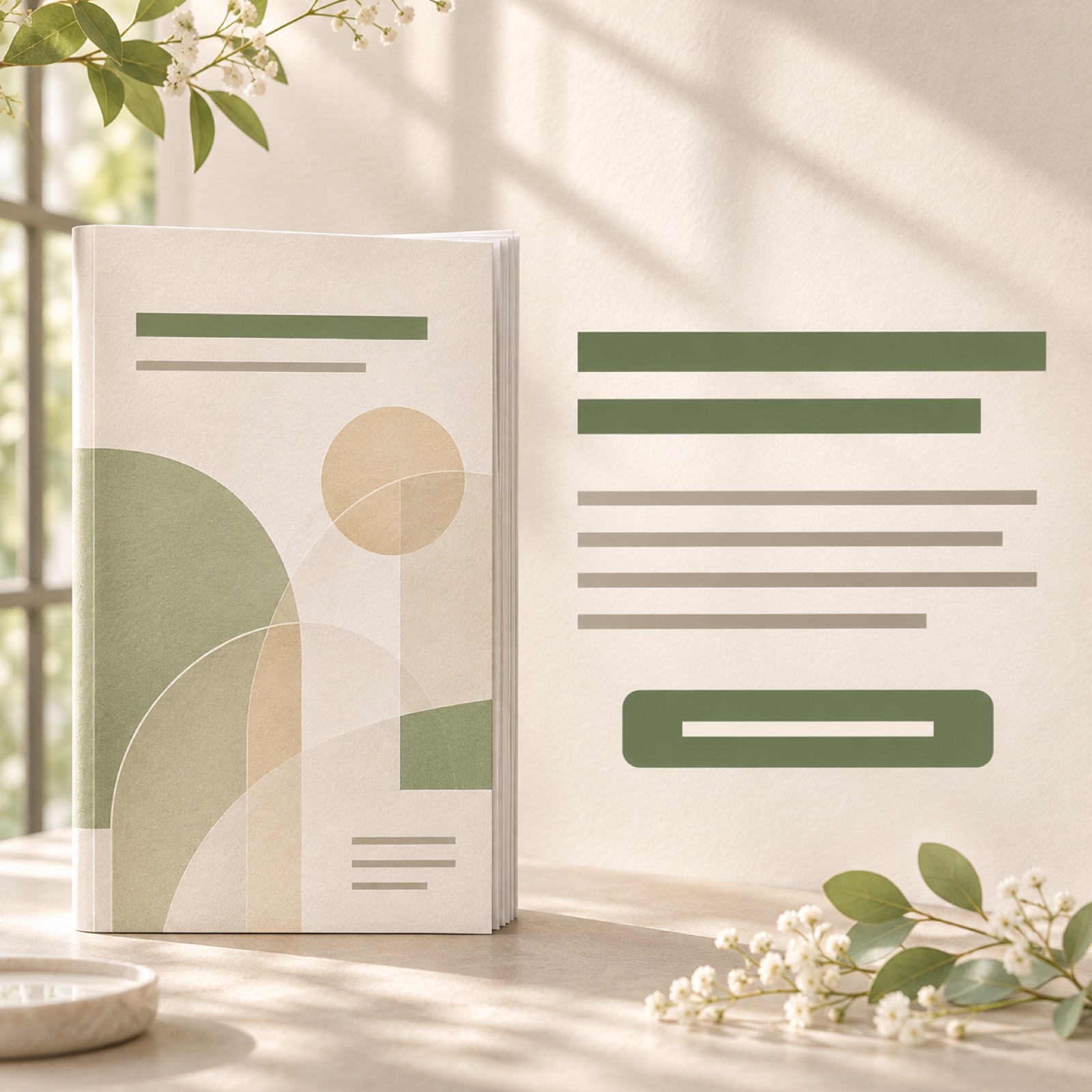
This hypothetical example is for readers who want to review the support offered before booking a consultation. Place a photo of the cover of your actual service brochure on the left and 「相談の前に、サービスを知る。」 on the right. Put 「資料を請求する」 at the bottom, but use it only if you actually accept brochure requests. NOZZE’s official affiliate information includes ad copy and several banners intended to generate brochure requests.3 These can serve as references for an initial point of contact separate from consultation booking.
In AdForge’s ad search screen, find and save a reference that separates the brochure image from the description. During image ad creation, select that layout as a reference and add a brochure cover photo you have permission to use, service information, and Japanese copy. Compare the three designs generated in one batch for cover distortion, Japanese wording, and the call to action, then download your chosen result. Register the ad in your ad account, run it, and review performance directly in your existing ad management tool.
Key takeaways
A counselor introduction shows whom people will meet, a support process overview shows the help they will receive, and a cost overview shows the conditions for getting started. Choose a consultation space introduction when the atmosphere of a visit matters, or a brochure introduction when people need information before booking. Building Japanese designs around your existing photos and verified service details lets you answer specific questions people have before booking a consultation.
FAQ
Which banner should I create first if I only have one photo?
Start with a counselor introduction if you have a counselor photo, or a consultation space introduction if you have a room photo. Rather than layering several messages over one photo, communicate either a sense of ease or the atmosphere of a visit, and supplement it with verified descriptions from your service materials.
Can I say “free consultation” on a Japanese banner?
Use it only when you have confirmed the scope and conditions of the consultation actually offered for free. If you need to distinguish it from paid consultations, place the conditions nearby. If free availability has not been decided, use copy that describes the booking action, such as 「相談を予約する」.
What should I check when creating Japanese image ads in AdForge?
After entering your message in Japanese and verified service information, compare the counselor’s name, scope of support, amounts, and conditions in the result with the original materials. Also check that you have permission to use the counselor and facility photos. Review the generated copy for any added service promises.
Which of the three designs should I use for my ad?
First, choose a design with accurate photos and copy whose key message and call to action are legible even on a small screen. Then compare variations that change one reason to book at a time, such as a sense of ease, the support offered, or cost. Check actual booking results in your ad management tool; do not judge performance from the generated designs alone.
Related reading
Make your next ad with AdForge
AdForge (ad-forge.io) is an ad remake app: pick an ad you like and rebuild it as a video or image ad for your own product. Find references in the Meta and TikTok ad libraries, let AdForge write the script, AI narration and captions, then review and download. Every account starts with 12 free image ads.