Product Placement in Banner Ads: How to Space Product Sets and Leave Room Below
If the products in a set feel disconnected, start with the gaps between them. If the bottom feels cramped, review the size of the product group and the space below it together. This guide explains how to choose reference ads and compare new concepts using actual product photos.
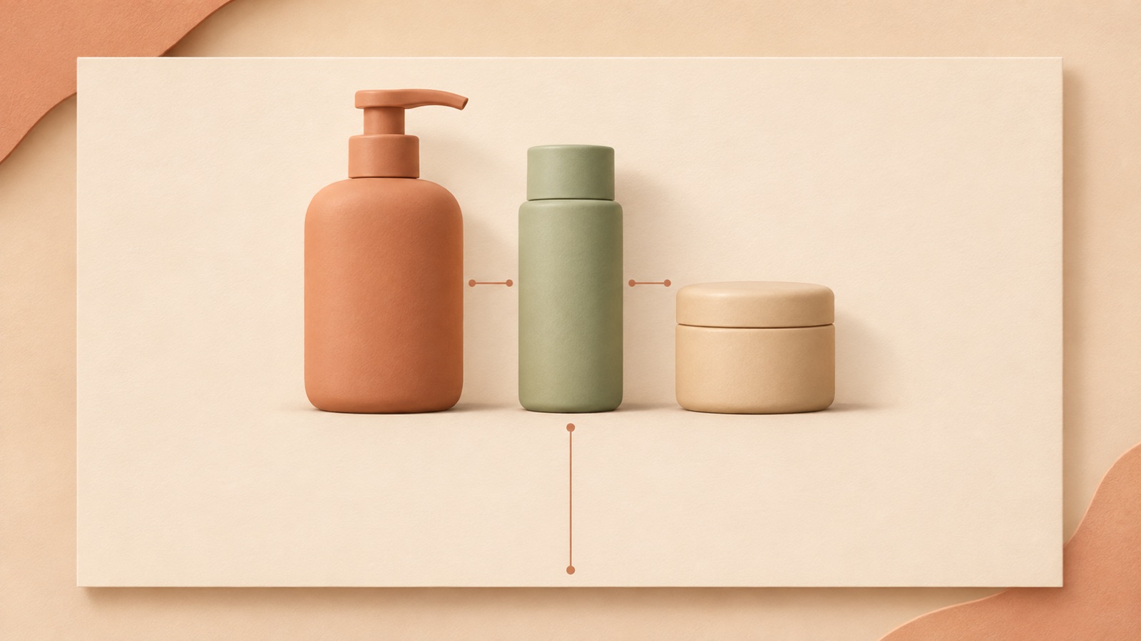
If products placed side by side do not feel like a set, first compare a layout with smaller gaps between them. If the bottom feels cramped, look at the overall size of the product group and the space occupied by the bottom copy, rather than trying to solve the issue simply by moving the products upward. Improving product placement in banner ads is less about filling empty areas and more about making the products read as a single set. This article walks through assessing spacing, choosing suitable reference ads, and reviewing three new image concepts in AdForge.
Look at the outline of the group, rather than each product individually
Start by viewing your current banner at a smaller size. When the containers’ silhouettes stand out before the text on their labels, check whether the three products read as one group. If the empty spaces between the products catch your eye first, you have a reason to compare a tighter arrangement. Whitespace is something to assess in terms of the relationships between elements, rather than simply leftover room. Adobe’s educational material on whitespace also offers an approach that examines whitespace by comparing different layouts.2
As a hypothetical example, consider a skincare set consisting of a toner, serum, and cream. If the toner sits at the far left and the cream at the far right, leaving only the serum in the center, the layout may look more like a display of individual products than a set. Imagine a rectangle enclosing all three containers. The starting point for this task is to reduce the gaps inside it. Focus on whether the whole arrangement looks like one group, rather than giving every product the same amount of space.
Assess product spacing and bottom space separately
The gaps between products and the space around the banner’s edges are separate issues. In an actual question about creating a skincare banner, feedback pointed out both excessive distance between products and insufficient space below them. The work was a practice banner using fictional products, so it cannot be treated as evidence of ad performance. It does, however, provide a concrete observation of how two problems can occur at once: products can feel disconnected while the bottom of the composition feels blocked in.1
When diagnosing the layout, look in order at the gaps between products, the space between the product group and the left and right edges, and the space between the lowest product and the bottom edge. If there is a price or purchase message at the bottom, also examine the gap between the products and that copy. In the hypothetical example, if the base of the cream container almost touches the bottom copy, tightening the product spacing alone will leave the layout feeling cramped. In that case, choose a layout with a smaller product group and one with more room for information at the bottom as candidates to compare.
Choose reference ads with the same number of items and similar silhouettes
Match the layout conditions before considering the mood of a reference ad. If your products are three containers of different heights, an ad that groups tall and short containers together will be easier to assess than one that features a single product at a large size. Even ads for a different product category can be candidates if the number of items, height differences, and copy placement are similar. Spacing between elements, visual separation, and establishing a focal point are also principles covered in Adobe’s general design educational material.3
In candidate ads, look at the width occupied by the product group, the space below the lowest product, and where the copy and products are separated. For the hypothetical example, one candidate could group three containers in the center of a light background, with only a short Japanese set name at the top. Since the goal here is to improve placement, do not choose a reference solely because you like its discount copy or decorative elements. In AdForge, you can review the layout and color analysis of saved image ads to assess where your products would go.
Create three concepts in AdForge using actual product photos
AdForge is a remake app that creates new ads by combining a reference ad with your product materials and message. First, search the ad library for an image ad to use as a reference and save it. Review the layout and colors in the saved ad’s analysis, then choose a composition in which the products look like one group and there is room at the bottom. Consider whether that same breathing room would remain with your own products. Even if the product count matches, it is difficult to assess the fit directly if the containers in the reference ad are much slimmer.
When creating an image ad, add actual product photos, product information, and the message you want to communicate based on the selected reference. Pasting a product page address can automatically populate the product information; review the populated details. In the hypothetical example, prepare photos of the toner, serum, and cream, the verified set contents, and the Japanese set name. Once you have confirmed that you have permission to use the uploaded materials, generating the ad produces three concepts that follow the reference layout. On the results screen, check the product count and shapes, copy, product group size, and bottom space. This process does not assume a feature that lets you adjust the gaps between individual products numerically.
Compare at the same size and decide the direction for the next concept
Display the three completed concepts at the same size for comparison. First, check at a small size whether the set reads as a single group, then enlarge the images to check for missing products or changes in shape. In the final version with the Japanese copy included, also check the gap between the lowest container and the bottom copy. Comparison notes will be more useful for your next choice if they describe the observed arrangement, such as “Space below the cream separates the product from the copy,” rather than simply “Looks clean.”
If the products form a clear group but the bottom still feels cramped, try a reference ad with a smaller product area for the next round. Conversely, if there is enough whitespace but the items have become too small to make out the set contents, look for a reference with a larger product group. This comparison helps you select a suitable layout; it does not establish ad performance. Download the reviewed creative and upload it directly to your ad account. Use your existing ad management tools for campaign setup, delivery, and performance review.
Key takeaways
If the products feel disconnected, examine the gaps within the group. If the bottom feels cramped, look at the group size and the space for information below it. Choose a reference ad with a similar number of items and similar silhouettes, create three concepts in AdForge using actual product photos, and compare them at the same size to establish a specific direction for the next round.
FAQ
How many pixels should I leave between products?
There is no universal pixel value to recommend in this article because product widths and heights and banner dimensions vary. Compare whether the products read as one set at the same display size, and assess the gaps between products separately from the space around the group.
If the bottom feels cramped, should I move the products upward?
If moving them upward brings them too close to the top copy, the problem simply shifts elsewhere. Look at the size of the product group and the space for information at the bottom together. For a new concept, you can consider reference ads with a smaller product area or a separate copy area.
Do I enter the spacing for each product directly in AdForge?
The method described here does not involve entering numerical spacing values. It involves choosing a reference with a suitable product grouping and surrounding space, then reviewing three image concepts created with actual product photos.
Can I immediately run whichever of the three concepts looks best?
Along with visual appeal, check that the actual set contents, product shapes, and Japanese copy are accurate. Download the creative that passes the layout review and upload it yourself, then check its performance after launch using your existing ad management tools.
Related reading
Make your next ad with AdForge
AdForge (ad-forge.io) is an ad remake app: pick an ad you like and rebuild it as a video or image ad for your own product. Find references in the Meta and TikTok ad libraries, let AdForge write the script, AI narration and captions, then review and download. Every account starts with 12 free image ads.