5 Instagram Ad Creative Spacing Examples: Checking Story Overlays and Arranging Elements
Judge spacing in Story ads by whether the copy and logo are actually visible, rather than by the amount of empty space. Explore five layouts using the same pouch and learn how to check for obscured elements in the preview.
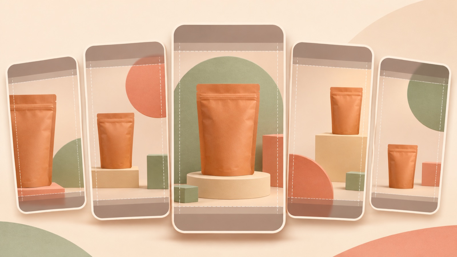
To plan spacing in Instagram ad creative, check that the product, logo, and purchase prompt are all visible in the Story preview. Practitioners in Korea have also looked for spacing guides out of concern that copy and logos might be obscured.1 Below are five hypothetical examples using the same travel pouch. Instead of providing verified safe-zone measurements, this article explains what might be obscured in each layout and the order in which to check the actual screen. The shared AdForge creation process is covered in the final example.
1. Product-centered layout
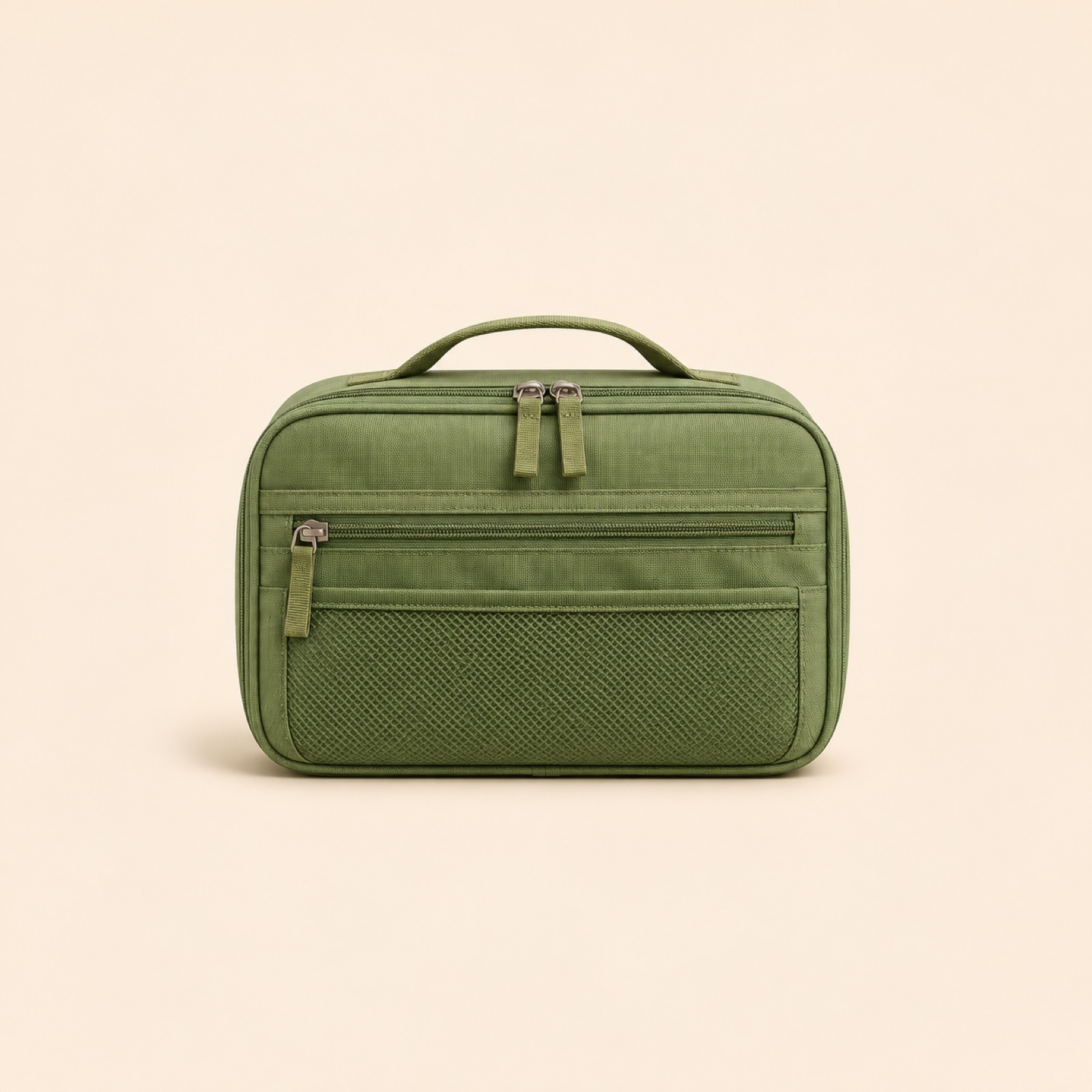
This is a hypothetical example. Place a green travel pouch in the center of a cream-colored vertical canvas. Put “Travel essentials, all in one place” above the product and “View the compartments” below it. Position the logo near the upper copy instead of placing it separately at the very top. Choose this layout when you have a front-facing product photo and want to show its shape first. Leaving the top and bottom free of decoration gives you room to move the main information group farther inside the frame.
In this layout, check the logo and upper copy first. Prepare two drafts for comparison: one with the logo at the top edge and another with it near the product. Open the Story placement preview in Ads Manager and see whether the logo overlaps with the elements actually displayed at the top, such as account information. Use the current screen as your reference rather than assuming the names or positions of display elements in advance. If moving the logo down causes it to collide with the product, reduce the product size as well to create space between the elements.
2. Purchase prompt moved toward the center
This is a hypothetical example. Place the pouch slightly above the center of the screen, with the purchase prompt “Unzip to see inside” directly below it. Leave only the background at the very bottom. This layout is intended for comparison with a draft that places the purchase prompt along the bottom edge. Keep the copy close to the product so the viewer’s eye moves from the product to the next action. This works well when the product description is short and a single photo makes the product type clear.
Check the relationship between the purchase prompt embedded in the image and the elements displayed at the bottom of the preview. If the current screen shows a purchase or destination button or other guidance, check whether the copy is hidden behind it or sits so close that they appear to be one group. Compare the two drafts based on whether even the lowest line of text is readable. If moving the prompt up causes it to cover the product, shorten the prompt or adjust the photo size. Do not assume that empty space at the bottom means the obstruction has been resolved.
3. Short copy beside the product
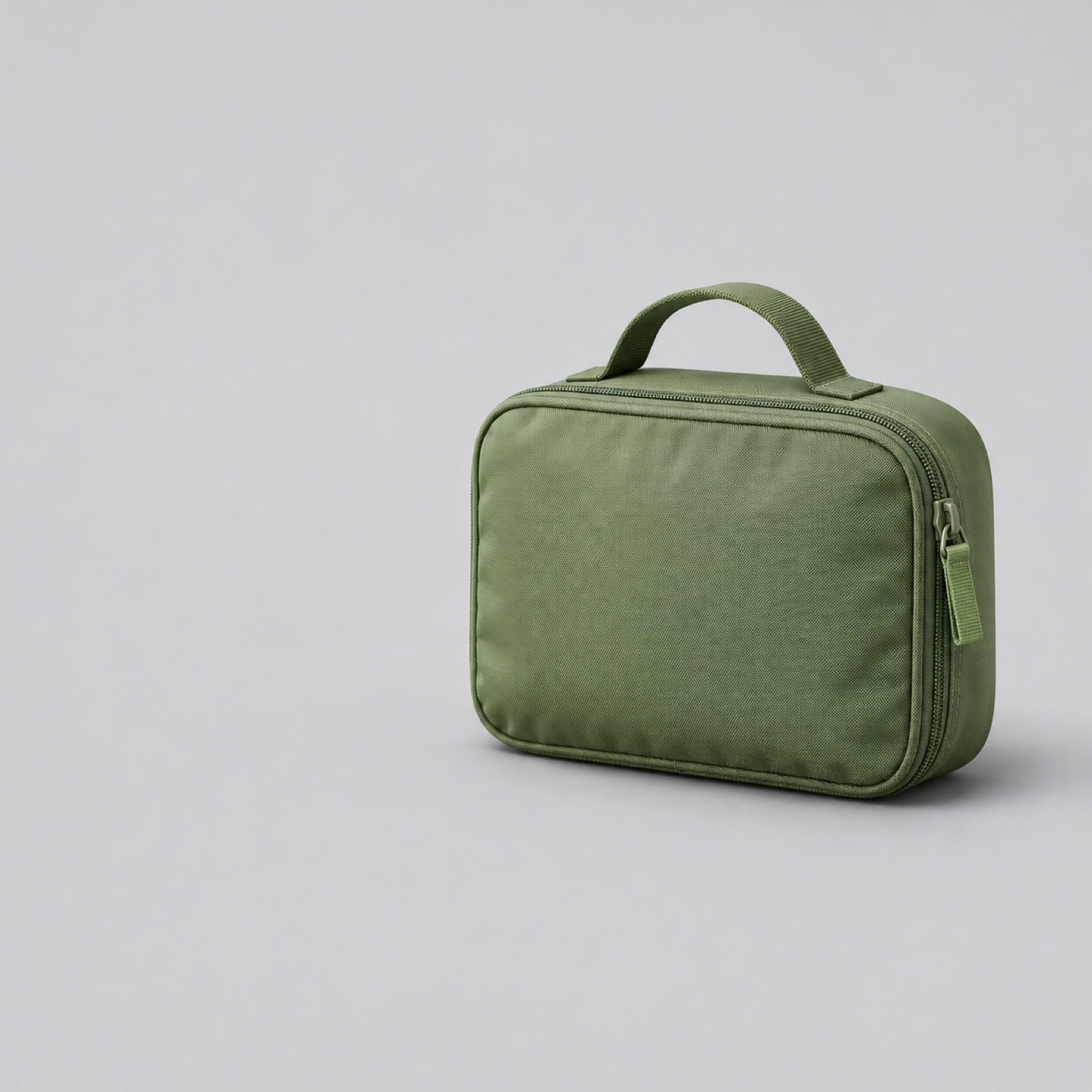
This is a hypothetical example. Place the pouch on the right against a light gray background, with “Organize small essentials” and “See inside” in the center-left area. Include the logo in the information group on the left. This uses the space beside the product instead of stacking copy above and below it. It suits a product photo with empty space on one side. However, dividing a vertical screen into left and right areas leaves less width for text, making it less suitable for long descriptions or multiple pricing conditions.
With this layout, trying to avoid obstructions at the top and bottom can result in text that is too small. Compare a version that retains the full sentence with one shortened without changing its meaning. In the Story preview, check for awkward line breaks and make sure the product’s zipper and strap are not cropped out of the frame. If display elements appear on either side, check for overlap with those as well. When choosing an AdForge reference, comparing the width of the copy area and the space occupied by the product before comparing colors better serves this purpose.
4. Product details grouped in the center
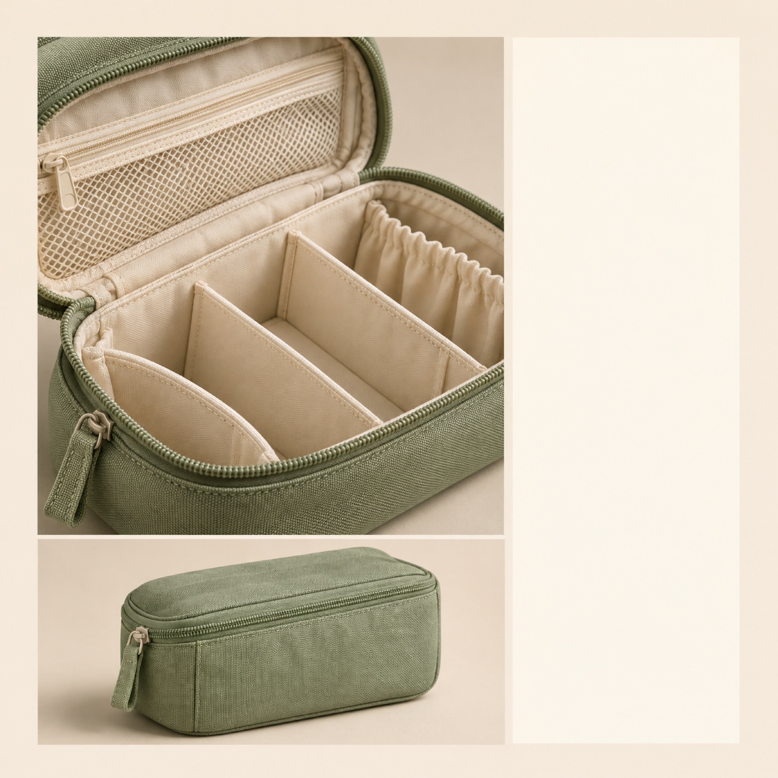
This is a hypothetical example. Place a large photo of the pouch’s internal dividers in the center, with a smaller photo of the whole product directly below it. Put “Take a look at the interior layout” in a solid-color area beside the close-up. Position the logo and purchase prompt near this central group as well. This suits products whose internal structure is a reason to choose them. If the close-up alone makes the product type hard to identify, showing the whole product alongside it helps viewers assess it.
This example is designed to check whether important details can be obscured even when all the text is visible. In the preview, check that the divider edges and opening are fully visible before checking the copy. If the description or on-screen elements cover those areas, reposition the close-up. A Shopify article features a Story ad example from Papaya Reusables.2 It can serve as a visual reference, but that example does not validate the safe spacing of this hypothetical layout.
5. Logo and purchase details grouped together
This is a hypothetical example. Below a front-facing photo of the pouch, place the logo, “1 pouch,” the actual selling price, and “View colors” in a compact information group. Keep this group away from the bottom edge and position it so viewers read it in connection with the product. This is a layout to try as an alternative to a draft whose top-positioned logo is obscured. It suits situations where the sales unit and price need to be shown together, but additional information can crowd out the product. In the preview, compare both the readability of the entire group and the product size.
Here is the shared process for creating this example in AdForge. In the ad discovery screen, search for Meta and TikTok ads and save references with the product and information grouped in the center. Review the saved images’ layout and color analysis, then select the reference in image ad creation. Add a real pouch photo you have permission to use, confirmed product information, and a Korean message to create three drafts. Check the product’s shape, quantity, price, and logo in the results, then download them. Compare the actual results rather than assuming the three drafts are guaranteed to have different spacing arrangements.
Upload the downloaded creative directly to your ad account and check the Story placement preview. Work from the top down through the elements actually displayed on screen, looking for overlap with the logo, key product details, price, and purchase prompt. If you find overlap, specify the element and change precisely, such as “Move the logo beside the copy above the product,” instead of saying “Move it farther inward.” Keep the same photo and message when comparing spacing. First choose a version in which the information is visible, then assess performance separately after launch using your existing ad management tools.
Key takeaways
Judge spacing in Instagram ad creative by whether the logo, product details, and purchase prompt are visible on the actual screen. Choose a hypothetical layout that suits your available photos, create drafts in AdForge, then identify exactly which elements overlap in the Story preview to decide on the final layout.
FAQ
How much space should I leave at the top and bottom of Instagram Story ads?
The provided sources do not establish the latest safe-zone dimensions in pixels or percentages. The layouts in this article are hypothetical examples for creating ads. Open the final creative in the Story preview and check for overlap between the elements actually displayed and the key information.
Will placing the logo in the center prevent it from being obscured?
Center placement alone cannot guarantee this. The logo may cover the product or copy. Compare a version with the logo at the top edge and one with it near the key information in the preview, then choose the version that also keeps the product visible.
Does AdForge automatically check Story safe zones?
The process described does not assume automatic safe-zone checks. Use AdForge to create image drafts with references and real product photos, review the results yourself, and then manually check for obscured elements in Ads Manager.
If an ad looks clear in the preview, will it perform better?
Checking for obstructions helps determine whether the information you want to communicate is visible. It does not guarantee performance. Prepare creative with readable information, then run the ad and review performance using your existing ad management tools.
Make your next ad with AdForge
AdForge (ad-forge.io) is an ad remake app: pick an ad you like and rebuild it as a video or image ad for your own product. Find references in the Meta and TikTok ad libraries, let AdForge write the script, AI narration and captions, then review and download. Every account starts with 12 free image ads.