How to Fix Ad Banners That Are Hard to Read on Smartphones: Check Japanese Prices and Copy, Then Rebuild
Even Japanese banners that look sharp on a PC can lose their price and purchase instructions on a smartphone. Here is a workflow for spotting problems at the actual display size and creating new concepts using reference ads with a clear text hierarchy.
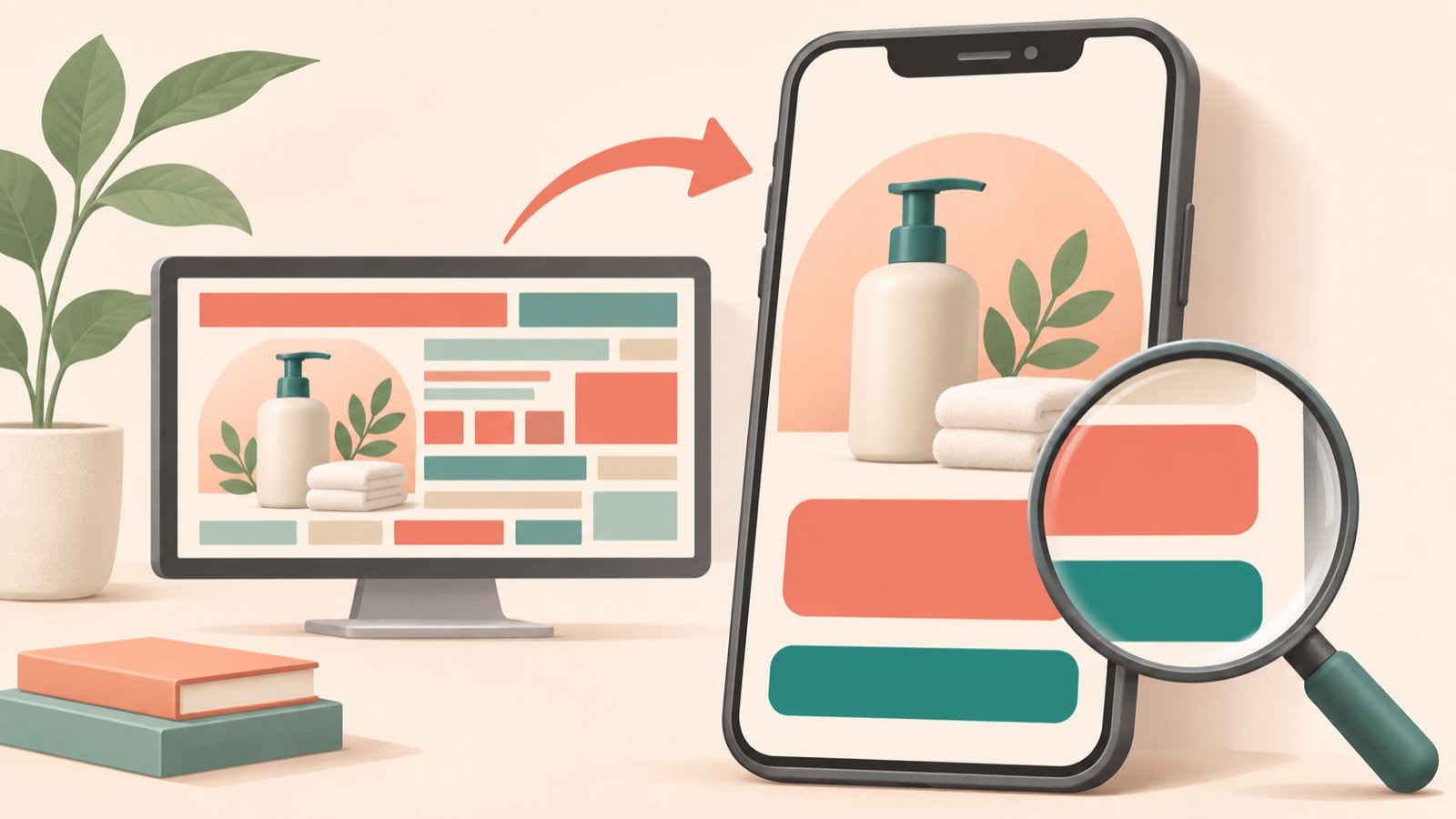
Improving ad banners that are hard to read on smartphones starts with checking how they actually appear, before looking at the font size in the original file. Check whether the headline, price, and purchase instructions are readable without zooming, then rebuild the banner using a reference ad with clear size differences between these three elements. Follow the steps below to identify where Japanese copy becomes too small and compare three image ad concepts created in AdForge under the same conditions.
Compare the original with its actual smartphone display
Start by checking the existing banner both at its original size on a PC and at the size it will actually appear as an ad on a smartphone. Simply opening the image file to fill your smartphone screen is not enough. Use a preview of the placement where you plan to run it, so you can see the width the image occupies along with the surrounding screen. Some comparisons show text that is readable in the original becoming unreadable when displayed at 50% size. However, you should not treat this ratio as the display condition for every ad.2
Without pinching to zoom, try reading the product name, price, and purchase instructions in that order. Make a separate note of anything that makes you bring the screen closer or guess the meaning. For example, write down observations such as “The price digits are visible, but the yen notation and conditions are blurry” or “The purchase instructions look like decoration.” This helps you decide which information needs a different position or greater emphasis in the next concept, instead of simply making all the text larger.
- Check whether you can distinguish the headline from the product name without zooming.
- Read the currency and applicable conditions as well as the price digits.
- Check whether you can explain the next action after reading the purchase instructions.
Define each piece of information’s role before setting a minimum font size
Even if you search for a “minimum banner font size,” avoid applying one pixel value to every creative. With the same original dimensions, the apparent size of the text still changes when the banner is displayed at different widths on a smartphone. Look at both the size difference between the main and supporting copy and the problem of supporting copy becoming unreadable in small ads.1 In practice, use these criteria: whether the headline explains what the product is for, the price lets people assess the purchase conditions, and the purchase instructions make the next action clear.
Let’s use a hypothetical storage pouch ad as an example. Assume the headline is “バッグの中をすっきり,” the price is “2,480円,” and the purchase instructions are “カラーを選ぶ.” This is a hypothetical price used for illustration. Instead of setting all three lines at the same size, aim for a layout that makes the product’s purpose and price distinct at first glance. Any price conditions needed for the actual sale must also be readable, rather than hidden in small text. Consider whether detailed specifications are essential to the purchase decision and organize them separately.
Choose reference ads whose prices and purchase instructions stay readable when reduced
Choose reference ads based on the role of the text rather than the color palette. Look for layouts where the headline and price appear as separate blocks and the purchase instructions do not blend into the surrounding copy. View each candidate image at a small size on a smartphone and check, in order, what is being sold, how much it costs, and what to do next. Guidance on examining the size difference between main and supporting copy can inform these selection criteria.1 Checking whether the shape of the product photo is similar to your own assets also makes it easier to narrow down suitable layouts.
AdForge’s Meta and TikTok ad libraries let you search ads that are running and see how many days each ad has been running. For this task, find and save image ads, and refer to the layout and color analyses provided. Do not assume that an ad’s readability or performance has been validated simply because it has been running for a long time. For each candidate, note both your reasons for choosing it and its limitations, such as “The price has its own area” or “There is not enough space for long Japanese copy.” This makes it easier to choose an ad to remake.
Create three concepts in AdForge using your product photos and Japanese messaging
Open the ad library in AdForge, then select and save an image reference that meets the criteria you defined earlier. Next, on the product information screen, add your product photos, product information, and selling points. You can also paste a product page address to fill in the product information automatically. Check that any automatically populated information matches the actual product. Use actual product photos that you have verified you have permission to use, and prepare shots that make the product’s shape recognizable even on a small screen.
At the image ad creation stage, add your Japanese headline, price, and purchase instructions to the selected reference and product assets. For the hypothetical pouch above, enter the three lines along with a clear description of your intent, such as “The price and purchase instructions must each be visually distinct.” AdForge follows the reference layout to create three concepts at once using your actual product photos. On the results screen, review the product’s appearance, Japanese text, and price, then download the concepts. Instead of copying the reference ad’s wording directly, check that the content fits your own product information.
- Choose an image reference with a clear text hierarchy from the ad library.
- Add product information and actual photos you have permission to use.
- Enter the Japanese headline, price, and purchase instructions you have reviewed.
- Review and download the three generated results.
Compare the downloaded concepts under the same smartphone conditions
Compare all three concepts on the same smartphone using the same placement preview conditions. If you enlarge the originals and compare only how sharp the text looks, you may miss the initial problem. Look at each concept and record what you can read of the headline, price, and purchase instructions. Evaluate each piece of information with notes such as “The headline is readable, but the price conditions are hard to check” or “The price is clear, but the purchase instructions get lost.” Since reducing the display size can change readability, make your final judgment at the actual display size as well.2
Suppose that, in the hypothetical pouch ad, only the headline is readable in the first concept, the price is also readable in the second, and the purchase instructions are distinct in the third. Choose the third for further review, while also checking that the product and price information are accurate. If all three are hard to read, create them again using a reference with a more clearly defined price area. Do not plan the workflow around pixel-level text adjustments or automatic readability checks in AdForge. Download the finished creative and upload it directly to your ad account, then continue checking performance in your existing ad management tools.
Key takeaways
For Japanese banners that are hard to read on smartphones, check the headline, price, and purchase instructions separately at the actual display size. Use a reference with clear differences in information size to create three image ad concepts in AdForge, then choose a readable result under the same smartphone conditions for your next campaign.
FAQ
Is there a minimum font size that applies to all Japanese banners?
It is difficult to use a specific pixel value from the provided materials as a universal standard for every banner. Check both the original dimensions and the actual display size, and make sure the main and supporting copy are distinguishable.12
If the price digits are readable but the conditions beside them are small, can I use the banner as it is?
If the copy is needed to understand the purchase conditions, revise the layout so it is readable alongside the price. Do not use large price digits alone as the acceptance criterion; check that the currency and applicable conditions can also be read without zooming.
Does AdForge automatically check font sizes in Japanese banners?
Automatic readability checks are not among the confirmed features. You need to create the image concepts, download them, and review them yourself at their actual display size on a smartphone.
Will a more readable concept also perform better as an ad?
Readable text alone does not guarantee performance. First, choose creative that communicates the message and price, then upload it directly to your ad account and check campaign results in your existing ad management tools.
Make your next ad with AdForge
AdForge (ad-forge.io) is an ad remake app: pick an ad you like and rebuild it as a video or image ad for your own product. Find references in the Meta and TikTok ad libraries, let AdForge write the script, AI narration and captions, then review and download. Every account starts with 12 free image ads.