5 Suitcase Ad Banner Examples: How to Show Packing Space, Folded Size, and Use Cases
To communicate packing space and folded size through suitcase photos alone, start by choosing how to make the comparison. Here are five banner layouts for a Japan launch and the steps for creating concepts in AdForge.
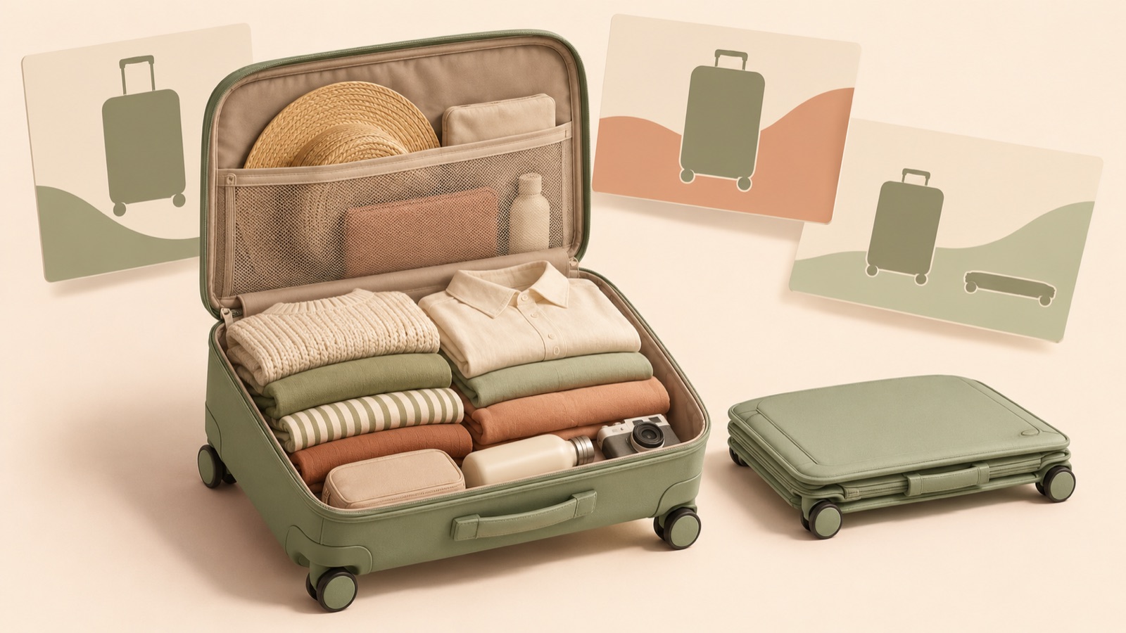
If you are looking for suitcase ad banner examples, show packing space with an open interior photo, folded size with a comparison of the whole product, and use cases with the surrounding space visible. Rather than fitting all three into one image, we recommend separate layouts for the questions buyers are likely to ask. All five examples below are hypothetical. Choose a layout that works with your existing photos, decide on a Japanese message, and use it to create three image concepts in AdForge.
1. Capacity Comparison: What Changes When You Have More to Pack?
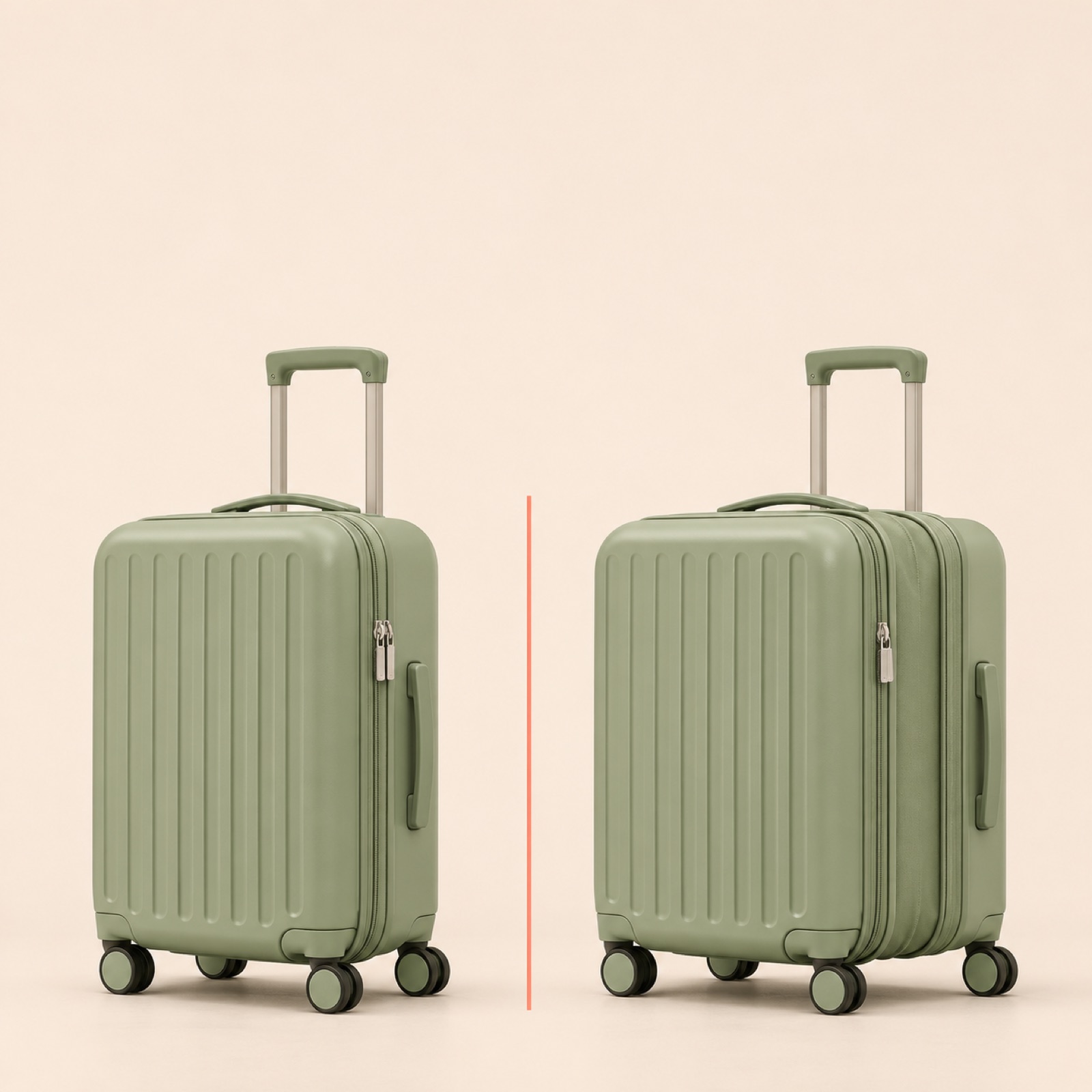
This is a hypothetical example. For a size-adjustable suitcase, place a full-product photo of its smallest configuration on the left and its largest configuration on the right. Align the floor level where the wheels touch, and keep the photographic scale consistent. At the top, explain the reason for the change with copy such as 「荷物に合わせて、サイズを変える」. An actual suitcase banner design brief also requests a comparison of the minimum and maximum sizes using full-product views.1 This layout helps explain that the images show the same product changing size, rather than a comparison between a small product and a large one.
When adapting this layout to your product, first establish what changes between the two configurations. If only the height changes, do not retouch the photos to suggest that the width also increases. If you state a capacity, use verified product specifications; if you only have photos, label the configurations without numbers. In AdForge, choose a side-by-side comparison reference, then enter photos of the two actual configurations and the selling points to generate image concepts. First check that the wheel and handle positions, along with the relative sizes of the two product views, match the originals.
2. Packing Layout: Where Will My Belongings Fit?
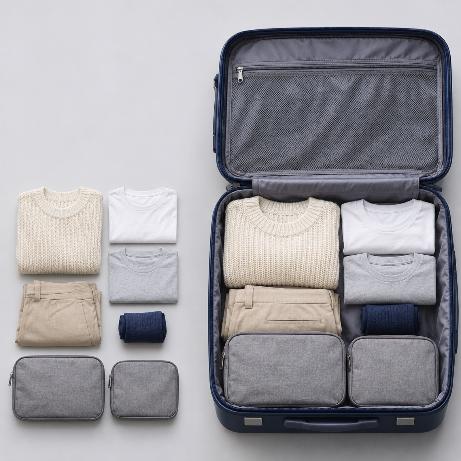
This is a hypothetical example. On the right side of the banner, prominently display a photo of the open suitcase packed with clothing and pouches. On the left, add a smaller photo of those same items unpacked and lined up to connect the before and after. Use a consistent light gray background, and limit the copy to one sentence explaining the photos, such as 「旅の荷物を、ひとまとめに」. The aim is to reduce the effort of reading a capacity figure and imagining how much will fit. Highlight interior dividers and pockets only to the extent that they are visible in the actual photo.
For your own product, use the items that actually fit inside during the shoot. If you compressed the clothes or used separate packing bags, reflect those conditions in the copy as well. Since packing needs vary from person to person, it is difficult to make definitive claims about trip length. Without supporting evidence, show the packed items instead of describing the suitcase as suitable for a certain number of days. In AdForge, you can refer to a layout with one large photo and a smaller supporting photo. If the generated result adds pockets or belongings that are absent from the original, do not use it as is; choose a concept that matches the photos you supplied.
3. Storage Space: Where Will It Go After the Trip?
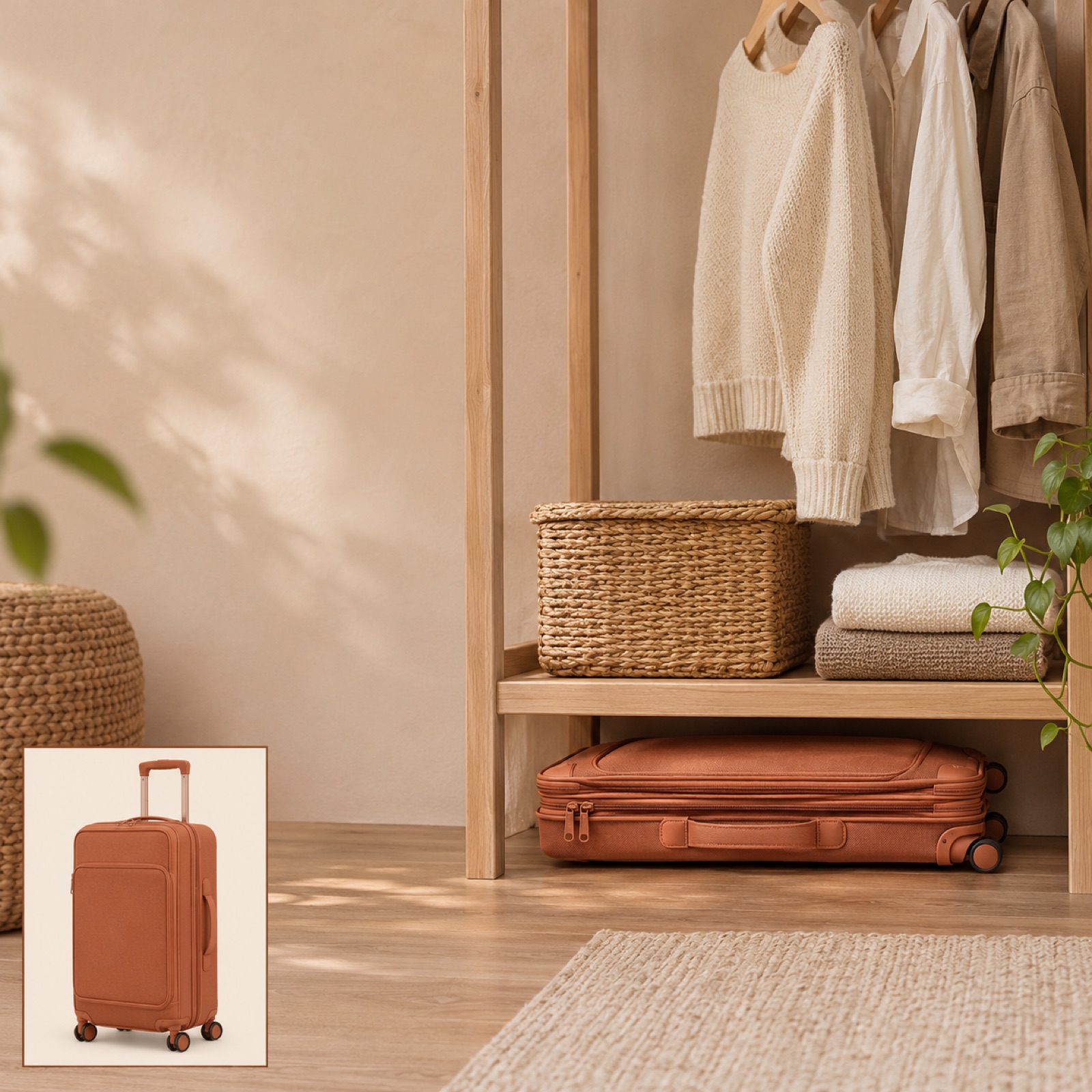
This is a hypothetical example. Use an actual photo of the folded suitcase at the bottom of a closet as the banner's main image. Add a small full-product photo of the unfolded suitcase in one corner, with the headline 「旅のあとも、しまいやすく」. Leave enough space for viewers to understand the storage location and its relationship to nearby objects. The point is to show how much room the suitcase takes up at home, rather than simply showing that it folds. However, do not present the small suitcase in the storage scene and the large suitcase in the supporting photo as a size comparison.
When creating this banner for your product, choose a photo taken in a space where it actually fits. Arbitrarily shrinking a suitcase and compositing it into a photo of an empty closet can misrepresent whether it will fit. If you want to emphasize folded thickness, state the measurement only when it has been verified, and avoid broad claims suggesting that it will fit in any closet. In AdForge, provide photos of the folded product and the storage scene, and specify convenient storage as the selling point. Compare the concept with the originals to check the product's folded shape and its proportions relative to the surrounding space.
4. Use Case: What Kind of Outing Will I Take It On?
This is a hypothetical example. Use a large photo of the suitcase standing in an entryway, with shoes and a small travel bag visible beside it. Match the headline to the scene of preparing to leave, with copy such as 「次の週末、何を持っていく?」. Near the bottom, place a small 「商品を見る」 where it does not obscure the full product. The aim is to help viewers picture their own outing, rather than explain the product's construction in detail. Canva's banner design resources also offer a reference for planning the photo and message placement together.2
For your product, use an actual use-case photo you have available. If you only have an entryway photo, do not extend the message to imply airport travel or carry-on suitability. If you have no use-case photos, you can start with a photo of the suitcase and actual travel essentials against a solid background. In AdForge, choose a reference that gives the product a prominent position, then enter the photo and a message focused on the situation. When comparing a use-case banner with a packing banner, keeping the call to action identical makes it easier to examine the different reasons to buy that each banner communicates.
5. Launch Announcement: Where Should Viewers Go After Seeing the Features?
This is a hypothetical example. Place a large image of the unfolded suitcase on the left, with a photo of the folded configuration and a short launch announcement on the right. Use 「広げて使う。たたんでしまう。」 as the headline, with 「Makuakeで詳細を見る」 beneath it. Use this copy when linking to a project that is actually live. This layout tells readers what to do next once they understand the features. Before the project goes live, change the copy to an action you can currently offer, and do not include unconfirmed discounts or remaining quantities.
The process in AdForge is as follows. Find and save ads in the Meta and TikTok ad libraries that separate product photos from short informational copy. Review the layout and color analysis of the saved image ads, then choose a reference for image ad creation. In the product information, enter the actual features and the Japanese message you want to use, and upload product photos showing the unfolded and folded configurations. Image ad creation follows the reference layout and uses the actual product photos to generate three concepts at once.
Review the three concepts in this order: product shape, copy accuracy, and readability on small screens. Set aside any concept where Japanese line breaks disrupt the meaning or the folded configuration looks like a different product. Check that you have the rights to use the uploaded materials, then download your selected result. If further adjustments are needed, you can use Adobe Express, which supports uploading your own photos, editing text and templates, and downloading the result.3 Upload the finished creative directly to your ad account, and use your existing ad management tools to run the ads and review performance.
Key takeaways
Plan suitcase banners around packing space, size changes, storage locations, use cases, and launch announcements. Choose layouts supported by your existing photos and give each one a Japanese message to establish a clear creative direction. Compare the three AdForge concepts against the product's shape and the intended copy before choosing creative to run.
FAQ
Which banner should I create first if I have only a few photos?
If you have unfolded and folded views, start with a size comparison banner. An interior photo suits a packing banner, while an actual storage photo suits a storage-space banner. The guiding rule is to avoid adding benefits that the photos do not substantiate.
Should I translate all of the Korean explanation into Japanese copy?
First choose one question for each banner to answer. For a size comparison, describe the change; for a storage banner, describe the storage situation. Rather than translating the entire long product description, retain the copy needed to understand the photo, then review the Japanese wording and line breaks.
Can I use the same banner on Makuake and in social media ads?
You can use the same concept, but check cropping and text size separately in each actual placement. Do not treat dimensions listed in a specific design brief as a universal specification for all of Makuake.1
Which of the three concepts should I choose?
Choose a concept that shows the product accurately, clearly communicates one feature, and makes the next action obvious. Prepare creative for packing, storage, and use cases, then check actual responses in your existing ad management tools. Do not predict performance from a concept's appearance alone.
Make your next ad with AdForge
AdForge (ad-forge.io) is an ad remake app: pick an ad you like and rebuild it as a video or image ad for your own product. Find references in the Meta and TikTok ad libraries, let AdForge write the script, AI narration and captions, then review and download. Every account starts with 12 free image ads.