How to Simplify Information-Heavy Banner Ads: Copy and Product Photos
If product details, pricing, and offers have made your banner cluttered, don’t start by shrinking the text. This guide explains how to decide what stays, what moves elsewhere, and how to create new concepts built around product photos.
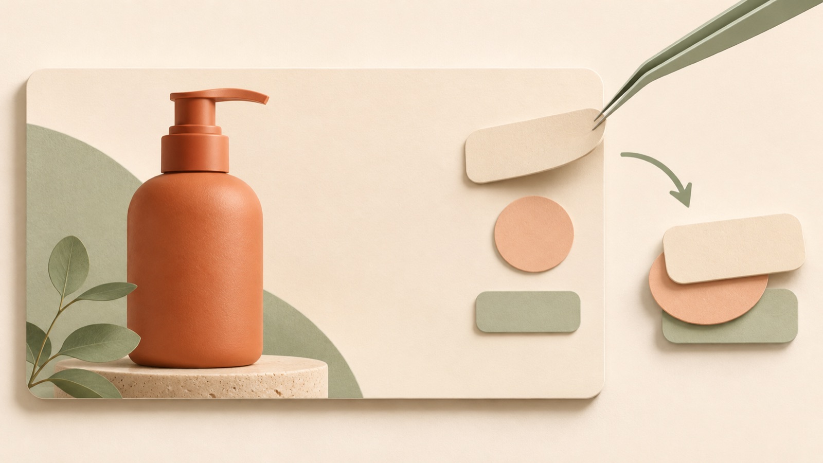
Simplifying an information-heavy banner ad starts with deciding what people should understand first, rather than what you can squeeze in at a smaller size. Start by keeping one core message, a product photo that demonstrates it, and copy that guides the next action. For everything else, consider whether it is essential to the purchase decision, then move it to the product page or a separate creative. This guide walks through organizing your existing banner, creating three new image concepts in AdForge, and comparing them on a small screen.
Group the information in your existing banner by role
First, copy the text from your existing banner into a separate document. Separate the product name, features, price, discount, shipping information, and call to action. Then group them into reasons to pay attention, information that explains the product, and purchase terms. Reviewing the banner’s information groupings, text legibility, color scheme, and layout together can help you identify what is competing for attention on the same screen.1
Choose one question for this ad to answer. What you keep will depend on whether the ad is explaining the product’s use to someone seeing it for the first time or presenting purchase terms to someone who is already interested. Next to each piece of copy, ask, “Would removing this cause someone to misunderstand the product or offer?” Keep what people need to understand, and move details they can read after becoming interested to the product page.
- Keep: Copy that explains the reason to buy in this ad
- Show together: Conditions that change the meaning of any price or offer you keep
- Move: Detailed information, such as materials and care instructions
- Separate: Messages about other customer situations or distinct offers
Decide whether the core message or the price should be read first
As a hypothetical example, consider a banner for a foldable lunch bag. If the original concept gives equal prominence to “foldable,” “lightweight,” “various colors,” “price,” and “shipping offer,” make “A lunch bag that folds flat after use” the central message this time. Use this wording when you can also show the bag actually folded. For Japanese copy, you could likewise draft a line around one use case, such as “使ったあとは、たたんでコンパクトに.”
You don’t necessarily need to remove the price. If price is central to this offer, make it the first thing people read. If the ad is intended to explain what the product is for, lead with the core message. Place the call to action, such as “View product,” next in the reading order. When adapting the copy into Japanese, check whether it communicates the same reason to buy briefly and naturally, rather than lengthening the sentences to retain every piece of information from the Korean original. However, do not make it shorter by removing essential conditions attached to a price or offer.
Choose a layout where product photos do the explaining
Choose photos as evidence of the core message, rather than decoration to fill empty space. In the hypothetical example above, a photo showing the difference between the bag open and folded fits the message better than a row of small bags in multiple colors. If the copy and photo explain the same thing, you can consider reducing separate explanatory boxes. When choosing a reference layout, also examine the relationship between the product area, copy area, and background color.1
Look at the reading order in a reference before its color palette. Decide whether a layout that leads people from recognizing the product to reading the core message and then to the call to action also suits your assets. LY Corporation’s creative training materials also recommend avoiding excessive elements and using expressions that are immediately understandable even at a small display size.2 Apply this principle by choosing a layout with enough room for your product and message, rather than one that packs text densely over a photo.
Create three new concepts in AdForge using your refined message
AdForge is an ad remake app that creates new ads for your product based on references. Start by searching for ads in the Meta and TikTok ad libraries, then save image ads that match the information priorities you established earlier. Use the layout and color analysis of the saved image ads to judge whether they provide suitable space for your product photos and short copy. You can also see how many days an ad has been running, but do not judge its performance by run time alone.
When entering product information, paste the product page address, review the automatically populated information, and clearly define the selling point for this ad. In the image ad creation screen, use the selected reference to create an ad with actual product photos and your message. AdForge follows the reference layout to generate three image concepts. This workflow creates new ads from your refined inputs; it does not automatically diagnose an existing banner or edit its individual elements.
- Choose a reference from the library with suitable placement for product photos and copy.
- Confirm the core selling point for this ad in the product information.
- Add the actual product photos and message to use in image ad creation.
- Check the product’s shape, copy, and conditions attached to prices and offers in the three generated concepts.
- Review whether you have permission to use the assets, then download the results.
Choose on a small screen and record a question for the next creative
Place the three concepts side by side at the same size, then compare them as they actually appear at a small size on a phone. First, check whether you can recognize what is being sold. Then see which reason to buy catches your eye. Also look for explanations that require zooming in, copy that blends into the background, and decorations that obscure the product. This applies the standard of immediate understanding at a small display size to your concept selection.2
Record a more specific reason for your choice than “It looks clean.” For example, writing “The folded state stands out, making the storage benefit easy to understand” gives you something useful for the next creative. If the other two concepts each emphasize different messages, also note that the comparison cannot easily be interpreted as a comparison of layout alone. Download the finished creative and upload it directly to your ad account, then use your existing ad management tools to run it and review performance. Start the next creative with a question worth answering separately from among the information you removed this time.
Key takeaways
To simplify a cluttered banner, establish the core reason to buy, then reorganize the reading order of the product photo and call to action. Create three new image concepts in AdForge and record why you chose one on a small screen to help define the direction of your next creative.
FAQ
Should I always cut down the text if a banner has a lot of it?
Identify the role of each piece of information before focusing on character count. Keep the core reason to buy and the conditions needed to understand the offer. If several different reasons to buy are mixed together, it is better to split them into separate creatives than compress them into one sentence.
Should I keep the price or the discount offer?
Decide based on the central offer in this ad. If the price itself is the reason to buy, emphasize it. If you need to explain the product’s use first, try giving the price less visual prominence. Also check the conditions that apply to any discount wording you keep.
If I upload an existing banner to AdForge, will it automatically fix the cluttered parts?
The process described here involves organizing your message, choosing a reference, and then creating three new image ads with actual product photos. It does not assume automatic diagnosis of an existing banner or the ability to directly edit individual elements.
Will the easiest of the three concepts to read also perform best?
A legibility review alone cannot determine ad performance. Select an easy-to-read concept as a production candidate, then check the results from actually running it. Use your existing ad management tools to upload creative downloaded from AdForge, configure campaigns, and review performance.
Related reading
Make your next ad with AdForge
AdForge (ad-forge.io) is an ad remake app: pick an ad you like and rebuild it as a video or image ad for your own product. Find references in the Meta and TikTok ad libraries, let AdForge write the script, AI narration and captions, then review and download. Every account starts with 12 free image ads.