Improve Banner Ad CTAs: From Japanese Purchase and Sign-Up Copy to Design Drafts
If your product and price are visible but the next step is unclear, start by choosing a CTA that matches the landing page. This guide walks through selecting Japanese copy, choosing a reference layout, and creating three drafts with AdForge.
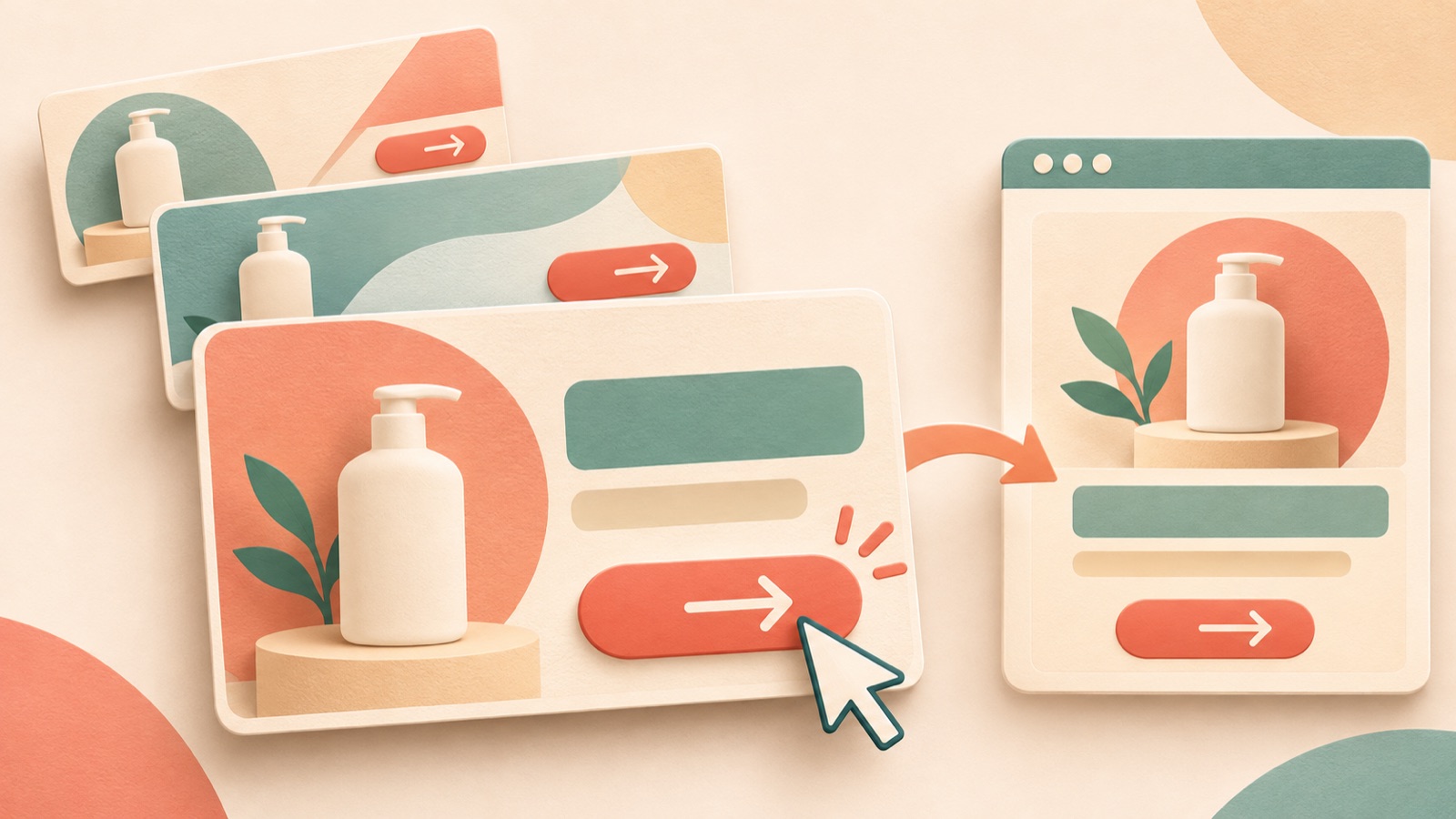
If your product and price are visible but the purchase or sign-up instructions are vague, define what people should do after clicking before making the button bigger. Improving a banner ad CTA starts with clearly describing the landing-page action in Japanese and choosing a reference layout that gives the copy its own space. Follow this guide to choose your CTA copy, create three image drafts with AdForge, and review them alongside the actual destination screen.
Start with what visitors will do on the landing page
Open your existing banner and landing page side by side. Check whether a banner prompting a purchase leads to a product list, or whether a sign-up prompt leads to an introduction to the consultation service first. Review both CTA copy and placement against the action you want visitors to take, such as purchasing, downloading a resource, or starting a free trial.2 First, write one sentence in Korean describing what visitors can do on the destination screen, then turn it into a Japanese CTA.
As a hypothetical example, suppose you are revising a banner for travel pouches. If visitors need to check the available colors and set contents on the landing page, 「商品を見る」 is an option. If the page lets them choose a consultation time, you could describe that actual next step with 「相談日時を選ぶ」. Avoid using 「購入する」 on a screen where visitors still need to read more about the product. Before making the wording more forceful, assess whether the destination screen delivers on its promise.
Make your Japanese CTA specific to one action
Create copy options with different levels of specificity about the action, rather than adding modifiers that mean much the same thing. For a hypothetical online consultation service, 「詳しく見る」 directs visitors to more information, 「相談内容を見る」 to consultation details, and 「相談を申し込む」 to an application. Choose the one that matches the landing page. Canva also describes CTA wording that fits the intended action, so it is better to start with what visitors will actually do than with the feel of the button.2
Mention free offers or the time required only when those conditions have been confirmed. Do not use 「無料相談」 if no free consultation is available, or describe an application as simple without evidence. Keep the core action inside the button, and put any essential explanation in a short sentence nearby. When asking someone to review the Japanese, ask both whether the wording sounds natural and what screen they would expect to see after clicking. This makes mismatches in meaning easier to spot.
Choose a reference ad with a distinct CTA area
Choose reference ads by looking at the relationship between the product, price, and action prompt, rather than just an attractive button. Adobe Express's banner design guidance also recommends readable messaging and a clear CTA.1 Check whether viewers can look at the product photo first, read the price, and then find the CTA. If your product photo is wide, a layout with space for copy below the image may be easier to adapt than a reference that places a button beside a tall product.
For the hypothetical travel pouch ad, you could place a photo of the pouches laid out at the top, the set contents and price in the middle, and 「セット内容を見る」 in a separate area at the bottom. Check that the button-like area does not blend into the product's pattern or a box highlighting the price. Review the layout and color analysis of image ads saved in AdForge, and choose a reference with room for your photo and Japanese CTA. Do not copy a competitor's wording or sales terms directly.
Create three drafts in AdForge using your product photo and CTA
Search for active ads in AdForge's ad library and save an image ad with a clear CTA area. Review the saved ad's layout and color analysis, then choose a reference for the image remake. When entering product information, you can paste the product page address to fill it in automatically. Check that the populated information matches the current offering, and prepare an actual product photo you have permission to use.
On the image ad creation screen, use your chosen reference and product photo, and include the finalized Japanese CTA and necessary product information in the message. For the hypothetical example, the input could be as specific as “Travel pouch set, use a photo of the actual set contents, CTA copy 「セット内容を見る」, separate the price from the action prompt.” AdForge follows the reference layout to create three drafts using your actual product photo. Check the wording and placement in the results yourself, then download the draft that matches your intent.
Compare the three drafts and check the actual destination screen
When reviewing the finished drafts, look beyond button color and check whether you can explain what happens when someone clicks. Confirm that the CTA is visible after viewers look at the product photo and read the price, that the Japanese copy appears as intended, and that the text does not break awkwardly inside the button. If both photo and copy placement vary across the three drafts, record those differences in your review notes. This will help you avoid attributing any later difference in results solely to the CTA copy.
Adding a button shape to an image and setting up an actual link are separate tasks.1 Upload the creative downloaded from AdForge to your ad account yourself, and check the destination address and campaign settings in your existing ad management tool. If the final banner in the hypothetical example says 「セット内容を見る」, check whether visitors can immediately find the set contents on the destination screen. Choose a draft whose CTA and landing page point to the same action as your candidate for the initial launch, then monitor performance in that ad management tool.
Key takeaways
Improving banner ad CTAs starts with defining what visitors will do on the landing page. Choose Japanese copy and a reference layout that fit that action, then review the three drafts created with AdForge to check that the wording, placement, and destination screen align.
FAQ
Can I use 「詳しくはこちら」 as a Japanese CTA?
It can be an option if it leads to detailed information. If it is unclear what visitors will be viewing, try naming the subject with wording such as 「商品を見る」 or 「プランを見る」. Choose the final copy to match what visitors can do on the landing page.
Does the CTA have to go at the bottom of the banner?
Rather than treating the bottom as a fixed rule, check whether viewers can find the action prompt after looking at the product and reading the price. The guiding principle is to review both copy and placement against the action you want visitors to take.2
Does creating a button in the image also set up the click-through link?
The CTA shown in the image and the actual link setup are separate.1 When uploading the downloaded creative to your ad account, you need to set the destination address and confirm that the landing page contains what the CTA promises.
Can I immediately compare CTA effectiveness using AdForge's three drafts?
Start by using them to review differences in wording and placement. If several elements change together, it is difficult to attribute performance differences to the CTA alone. AdForge is an app for creating ad assets; launching ads and checking performance take place in your existing ad management tool.
Make your next ad with AdForge
AdForge (ad-forge.io) is an ad remake app: pick an ad you like and rebuild it as a video or image ad for your own product. Find references in the Meta and TikTok ad libraries, let AdForge write the script, AI narration and captions, then review and download. Every account starts with 12 free image ads.