Better Banner Ad Colors: How to Choose Reference Ads That Work with Your Product Photos
If your banner colors feel cluttered, start by choosing reference ads around your product photo. This guide walks through assigning roles to background, accent, and text colors, then comparing three new concepts with Japanese copy.
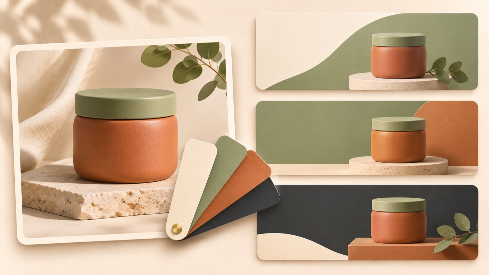
Improving your banner ad colors starts with choosing reference ads that let your product photo and Japanese copy work well together, rather than simply finding an attractive color palette. Check, in order, whether the product stands out from the background, where the accent color directs attention, and whether the text is easy to read. Use these criteria to choose a reference, then create and compare three image ads in AdForge using your actual product photo.
Identify the Colors to Keep from Your Product Photo and the Mood You Want
Start by viewing your current banner alongside the original product photo. List the colors of the packaging, the contents, and any props already in the photo. A banner background may look restrained on its own, but adding the photo can make several colors compete. For this task, use the product photo as your starting point and describe the desired mood in a short phrase, such as “calm and everyday” or “a casual gift.” This makes it easier to filter reference ads than a broad description like “premium.”
As a hypothetical example, consider a hand cream in pale pink packaging. If the existing banner has a mint background, an orange offer badge, and a purple headline, first assess which colors support the product. You could set a new direction of “a calm composition that draws attention to the pale pink packaging first.” This is a working criterion for comparing these concepts, not a definitive color palette. It gives you a starting point for reassigning the roles of the surrounding colors while keeping the product photo and message.
Look for Ads with Similar Product Colors and Layout Constraints, Beyond Your Industry
Do not choose reference ads simply because they are from the same industry. Check whether they feature light-colored packaging like yours, whether their photos contain several colors, and whether they leave enough room for Japanese copy. A background that works well with a white container will not necessarily suit pale pink packaging. In practice, shortlist ads where the product stands out from the background, the photo colors and banner colors do not compete, and you can explain how the ad creates your desired mood.
Search for active ads in AdForge’s Meta and TikTok ad library and save image ads that meet your criteria. Saved image ads are analyzed for layout and color, which can help you compare candidates. You can also see how long each ad has been running, but do not use duration alone to judge the quality of its color palette or its performance. For each candidate, write one sentence explaining why it is useful as a reference, such as “It makes a pink product stand out against a light background.” This gives you a concrete basis for your choice.
Separate the Roles of Background, Accent, and Text Colors
Review your saved ads and assess each role separately: does the background color support the product, does the accent color draw attention to information needed for a purchase decision, and does the text color make the copy easy enough to read? Looking at before-and-after color changes alongside basic principles can help you evaluate how combinations work on screen, rather than memorize color names.1 In practice, follow “What color is it?” with “What information is it being used for?” and write down your answers.
For the hypothetical hand cream above, you could use a light background to showcase the product and dark text to make the product description “持ち歩けるハンドクリーム” readable. Decide whether to use the accent color for an offer you actually provide or for a call to action. Contrast between background and text colors, along with the visual priority of highlighted information, are criteria for reviewing a banner.2 If every line of copy draws equal attention, reconsider what people should read first.
Choose a Reference Ad in AdForge and Create Three New Image Concepts
Open the screen showing your saved ads in AdForge, review the color and layout analysis, and choose a reference to apply to this product. When creating an image ad, select that reference and add your actual product photo and intended message. You can paste a product page address to automatically fill in product information. As you enter the details, make sure the product name, key selling points, and Japanese copy are consistent, and confirm that you have the rights to use the photo.
Image ad creation produces three concepts at once, using your actual product photo and following the selected reference’s layout. On the results screen, compare how the product is presented and how the colors work across the three concepts. This workflow creates new image ads rather than replacing individual colors in an existing banner. Apply your own product information and assets rather than trying to reproduce the reference’s logo or wording, and check that the finished ads convey your intended message.
- Review the color and layout analysis of your saved image ads.
- Choose a reference that suits your product photo and desired mood.
- Add your actual product photo, product information, and Japanese message.
- Review the three generated concepts and download the result you want to use.
Choose a Concept Where the Product and Japanese Copy Are Clear at Small Sizes
Compare the three concepts at the same display size. First, check whether you can recognize the product, then whether you can read the key Japanese copy. Along with contrast between background and text colors, review the font choice and the priority of highlighted information.2 If the colors around the copy are busy or highlights are scattered across several areas, even an attractive palette can make the reading order unclear. Reduce the ads to the size you will actually use and read them again.
Record your reason for the final choice in terms such as “The packaging color is clear, and the Japanese description can be read first,” rather than “It looks the best.” Because the three concepts may differ in composition as well as color, they are difficult to treat as a rigorous test of color alone. If none suits the product’s mood, return to reference selection and create new concepts using another candidate. Download your chosen creative and upload it directly to your ad account, then launch the ad and review its performance in your existing ad management tool.
Key takeaways
To improve your banner ad colors, first identify the colors in your product photo and the mood you want, then choose reference ads with similar conditions. Review the roles of background, accent, and text colors, and compare product presentation and Japanese readability across the three concepts created in AdForge. This gives you a clear reason for your choice.
FAQ
Do I need to include every brand color in a banner?
You do not need to put every color on one screen. Start by assigning roles to the colors that showcase the product, make the text readable, and highlight key information in this ad. Also check whether your brand colors already appear in the product photo.
Can I copy the colors of a Japanese ad for an ad targeting Japan?
An ad’s being Japanese does not automatically make its color palette suitable for your product. Choose reference ads with similar packaging colors, photo mood, and amounts of Japanese copy, then judge the results using your actual assets.
Can I change only the background color of an existing banner in AdForge?
The method described here creates three new image ads by applying your actual product photo and message to a reference layout. It does not assume features for specifying a particular color code or changing only the colors of an existing banner.
Will the ad that shows the product most clearly also perform best among the three concepts?
Product visibility and readability are selection criteria during production. They alone cannot predict or guarantee ad performance. Run the creative that passes your production review through your ad management tool and check the actual results.
Make your next ad with AdForge
AdForge (ad-forge.io) is an ad remake app: pick an ad you like and rebuild it as a video or image ad for your own product. Find references in the Meta and TikTok ad libraries, let AdForge write the script, AI narration and captions, then review and download. Every account starts with 12 free image ads.