5 Coffee Subscription Image Ad Examples: Japanese Price and Delivery Layouts
Decide whether to lead with the first-order price, bean selection, or delivery convenience. Explore five coffee subscription ad layouts for Japanese customers and the steps for creating concepts with real product photos.
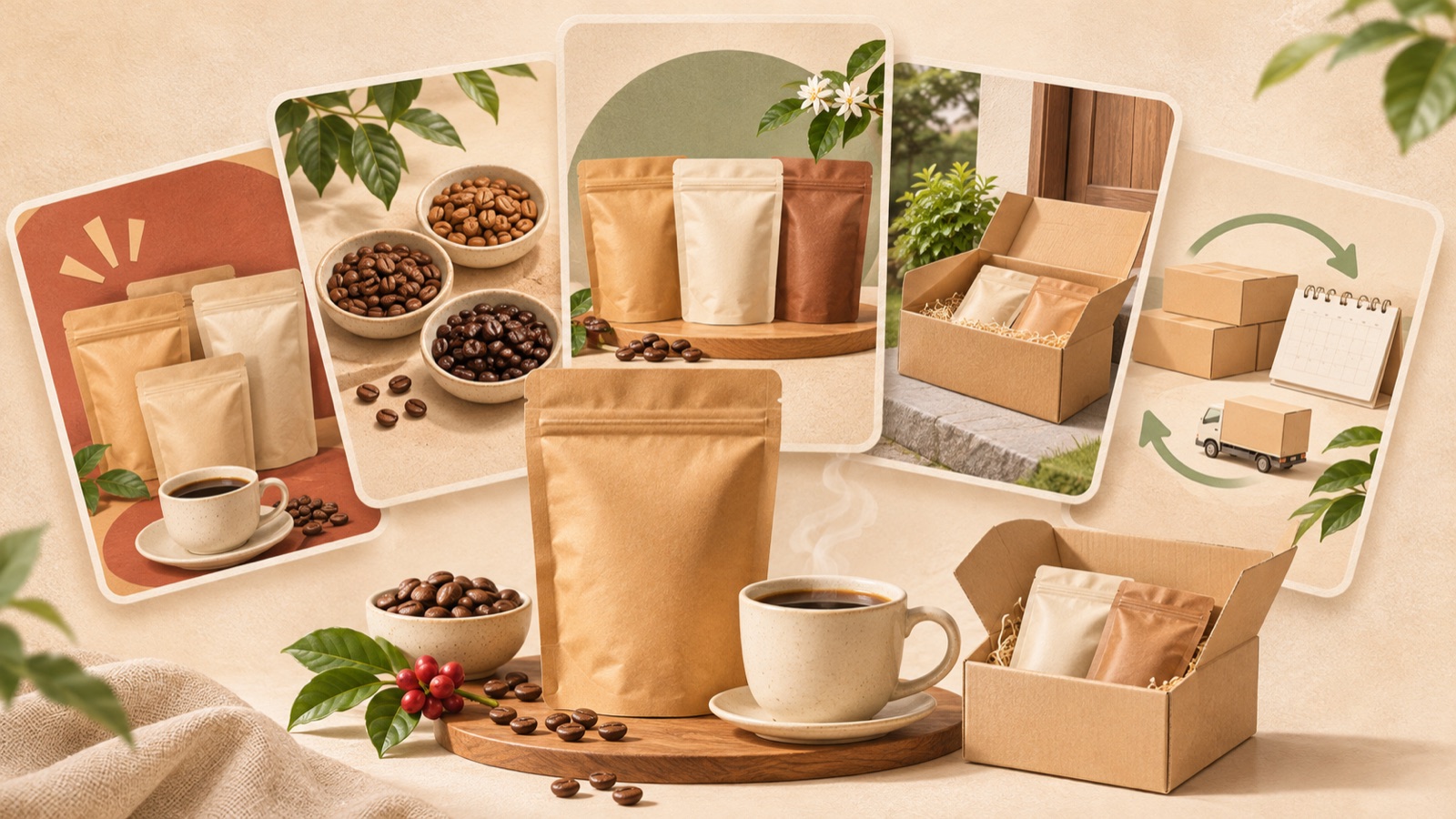
For coffee subscription image ads, lead with the price when the first-order offer is the main draw, or with the beans when choosing by taste is the main draw. Keep the first-order price close to the regular monthly fee, and try placing delivery terms directly above the call to action. The original assignment in the reference materials also includes a subscription, a monthly fee, a first-order price, and a call to action.3 Below are five hypothetical examples that organize this information around different reasons to buy. Choose a layout that suits your product, then follow the steps to create it with real photos and Japanese copy.
1. Trial-focused layout led by the first-order price
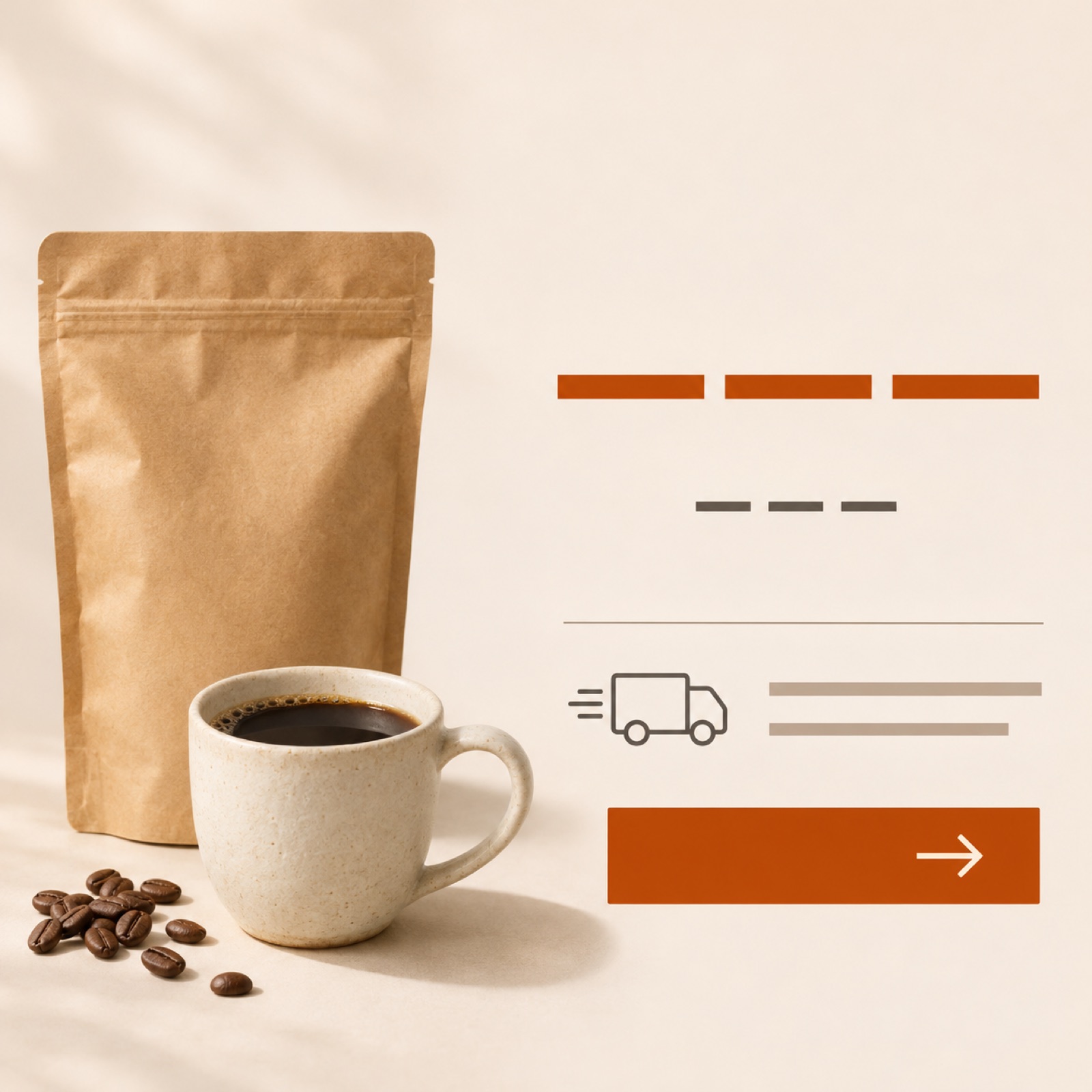
This hypothetical example suits products that need to communicate the initial purchase cost first. Place a coffee bag and cup on the left of a cream background, with 「コーヒー定期便」 and 「初回[amount]円」 on the right. Add 「2回目以降 月額[amount]円」 immediately below to distinguish the first-order price from subsequent charges. Finish with shipping cost information and 「定期便の詳細を見る」 at the bottom. The price is prominent, while the fact that the product is a subscription remains within the same field of view.
The aim is to communicate the cost of trying the product while reducing the chance that viewers remember only the low first-order price. The referenced design process also shows a three-part arrangement of photography, copy, and pricing, along with the difficulty of organizing price information. It is not a case study of actual campaign performance.1 When adapting this layout to your product, replace the discount status, first-delivery contents, and subsequent fees with your actual terms. In AdForge, choose a reference with a separate pricing area, add your product photo and Japanese message, and generate three image concepts. Then choose the one that makes the relationship between the two prices clear.
2. Choice-focused layout led by bean preferences
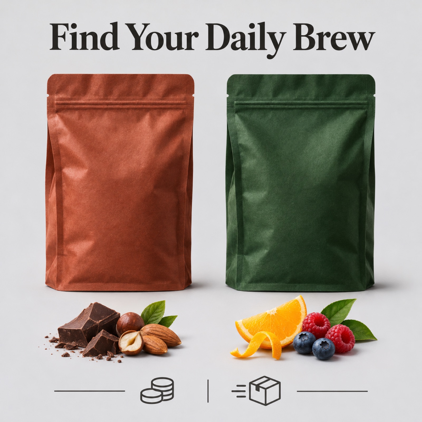
This hypothetical example works when bean selection is an actual strength of the service. Place two different coffee bags side by side at the same size in the center of a light gray background. Use 「好みに合わせて選ぶ定期便」 at the top, and add brief descriptions of acidity or roast level beneath the bags, based on the actual product descriptions. Group pricing and delivery information in a single area at the bottom. The layout is designed to help viewers understand why they would choose the products before checking the subscription cost.
When describing taste preferences, use consistent points of comparison instead of adding more evocative language. If one description mentions acidity and the other mentions only origin, the basis for choosing becomes unclear. This example does not fit a product that offers no bean choices or terms for changing selections. In AdForge, select a reference showing two products side by side, then add real bag photos and verified flavor descriptions. Check the three generated concepts to make sure the bag colors and product names have not been swapped and that both the first-order price and the regular monthly fee are included.
3. Delivery-focused layout showing the delivery schedule
This hypothetical example explains the convenience of receiving coffee at regular intervals. Make an open shipping box the main visual on a light brown background, and place the same number of coffee bags inside as in an actual delivery. Use 「いつものコーヒーを、定期便で」 at the top, with the delivery frequency and quantity per shipment below. At the very bottom, arrange the information in this order: first-order price, subsequent monthly fee, and shipping cost. The box photo also helps explain how much arrives in each delivery.
This example aims to answer the question, “How often does it arrive, and what do I receive?” For monthly delivery, use wording such as 「毎月お届け」, adjusting it to the actual schedule. Include free shipping, delivery date selection, or adjustable delivery intervals only if those options are available. In AdForge, choose a reference centered on a shipping box, then add photos of the actual contents and your delivery message. Check that the number of bags and their weight match the sales terms. Even when the image emphasizes convenience, choose a concept in which the regular monthly fee remains clearly visible against the background.
4. Contents-focused layout showing everything in one delivery
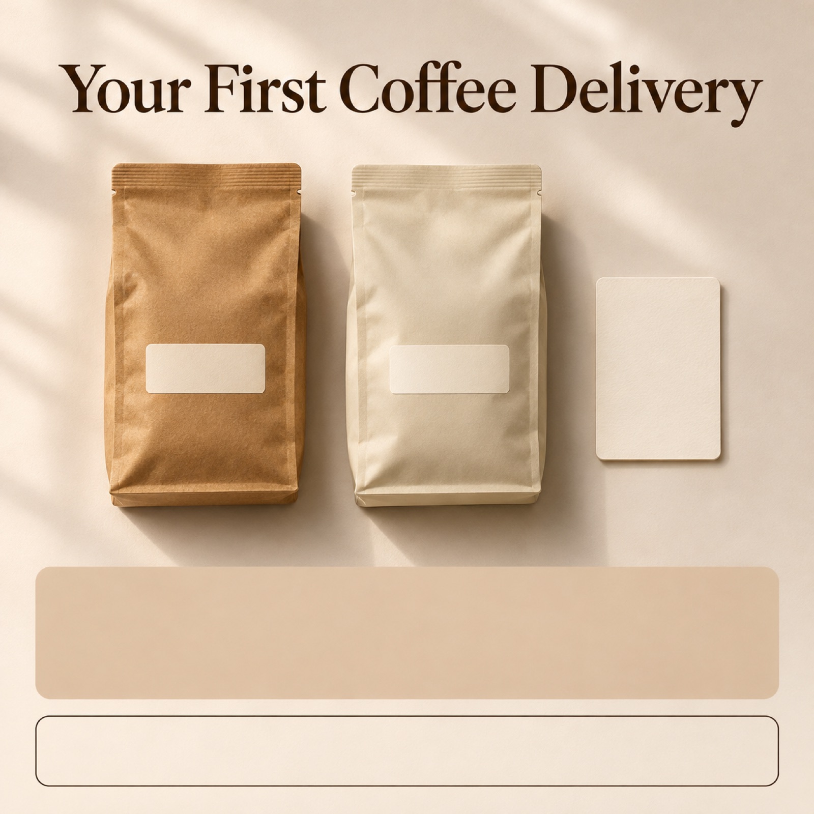
This hypothetical example suits products that need to explain what is included in the first delivery. Arrange the coffee bags and actual included items in a flat lay on an ivory background. Use 「初回のお届け内容」 at the top, and briefly label each item and its quantity nearby. Place the first-order price beneath the photo, followed by the contents and monthly fee for regular deliveries on a separate line. This layout works well for explaining the two sets of terms separately when the first delivery differs from subsequent deliveries.
Showing the contents at a glance helps readers understand what the first-order price covers. However, a cup or dripper used as a photo prop could be mistaken for an included product, so visually distinguish the contents from props. In AdForge, choose a reference that uses a flat lay product photo, then add photos of the actual contents and their quantities. When reviewing the three concepts, check for added gifts that are not included or duplicated items. If the contents apply only to the first delivery, make that scope clear in the Japanese copy as well.
5. Information-focused layout separating product, pricing, and delivery
This hypothetical example suits products that need to present the full terms in a measured way rather than emphasize a price offer. Place an actual coffee bag photo at the top, a brief product description in the middle, and pricing and delivery information at the bottom. Use dark brown text on a white background, with a single accent color for the first-order price only. The reference materials also include an individual design practice record of improving a coffee subscription banner, but this cannot be treated as evidence of sales performance.2 The aim is to guide readers from recognizing the subscription through to understanding payment and delivery terms in sequence.
To create this in AdForge, first find and save a reference in the ad library that separates photography from information, then review the image’s layout and color analysis. Select that reference on the image ad creation screen, and add your actual product photo, product information, and Japanese message. Prepare the copy in this order: 「コーヒー定期便」, 「初回[amount]円」, 「2回目以降 月額[amount]円」, and the actual delivery terms. Review the product appearance, Japanese text, prices, and delivery terms in the three generated concepts, confirm your rights to use the uploaded materials, and download your chosen result.
Key takeaways
Start with a price-focused layout if the initial purchase cost is your strength, a bean-focused layout if selection is your strength, or a delivery-focused layout if receiving convenience is your strength. Create concepts using real product photos and accurate Japanese sales terms, then choose a layout that makes both the first-order and subsequent payment terms easy to read together.
FAQ
Which should be larger: the first-order price or the regular monthly fee?
If the first-order offer is the main reason to buy, you can make the initial price larger. Place the subsequent monthly fee directly below it, however, so readers can distinguish when each price applies. We recommend keeping the two amounts close together.
How should I prepare Japanese pricing copy?
You can distinguish the first order with 「初回」 and the monthly fee from the second order onward with 「2回目以降 月額」. Match the wording to the actual billing arrangement, and ensure that tax inclusion and shipping costs also match the terms on the sales page.
Can I treat the ads in the reference materials as success stories?
No. The supplied materials are hypothetical design assignments and individual design practice records. They can serve as references for information layout, but they cannot be used as evidence of ad performance.123
How should I choose among the three concepts?
Compare whether viewers can recognize the subscription, distinguish the first-order price from subsequent fees, and see photos that match the actual delivery contents. Choosing one of the concepts created in AdForge and evaluating actual ad performance are separate tasks.
Can I run an image created in AdForge immediately?
You need to download the finished creative and upload it directly to your ad account. AdForge does not yet offer automatic campaign execution through ad accounts. Use your existing ad management tools to configure campaigns, run ads, and review performance.
Make your next ad with AdForge
AdForge (ad-forge.io) is an ad remake app: pick an ad you like and rebuild it as a video or image ad for your own product. Find references in the Meta and TikTok ad libraries, let AdForge write the script, AI narration and captions, then review and download. Every account starts with 12 free image ads.