5 Oseibo Banner Ad Examples: Arranging Products, Thank-You Messages, and Shipping Offers
Designing an Oseibo gift set ad becomes easier once you decide whether the thank-you message, product photo, or ordering information should come first. Explore five hypothetical examples and the steps for creating mockups with AdForge.
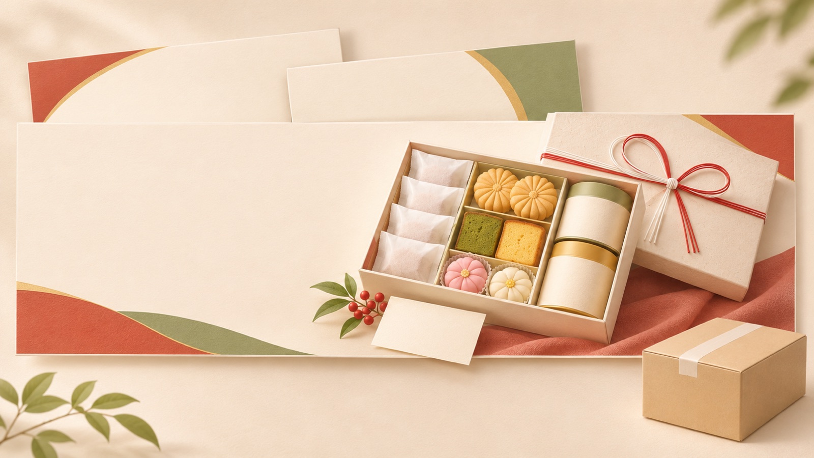
If you are looking for Oseibo banner ad examples, start by choosing one focal point: the thank-you message, the product, or the order deadline. Making the photo and headline prominent and grouping the order window and shipping conditions in a separate area helps establish a clear information hierarchy. All the examples below are hypothetical. They are layout ideas to apply to your existing gift set photos, rather than examples with verified advertising results. Review the reasoning behind each layout and the information to replace, then use AdForge to prepare three image ad mockups for comparison.
1. A Central Thank-You Message with Gift Photos on Either Side
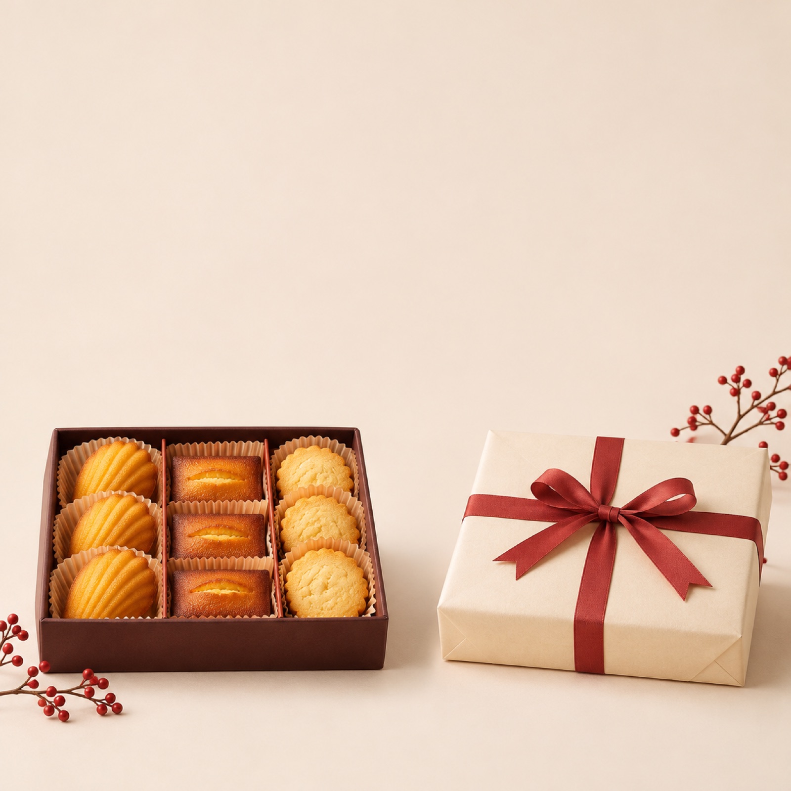
This is a hypothetical example. Place the Japanese thank-you message 「一年の感謝を込めて」 in the center of a horizontal layout, with an open confectionery box on the left and a wrapped box on the right. A warm cream background and a dark brown headline are suggested. Group the order window and a call to action such as 「商品を見る」 at the bottom. The reference article also includes a self-created banner featuring a central message and photos on either side. However, that article does not document a live ad campaign or verified performance.1
This layout suits ads that need to communicate both what the gift is and the sentiment behind sending it. Keep just one thank-you sentence in the center, and place the product name and item count near the photos. To adapt it to your product, prepare one photo showing the contents of the box and another showing it wrapped. In AdForge, select a reference with a central message, then add your actual photos, thank-you message, and verified ordering information to create image ad mockups. Compare the results to check that the central text and products on either side do not obscure one another.
2. A Product-Focused Layout Featuring a Large Open Fruit Box
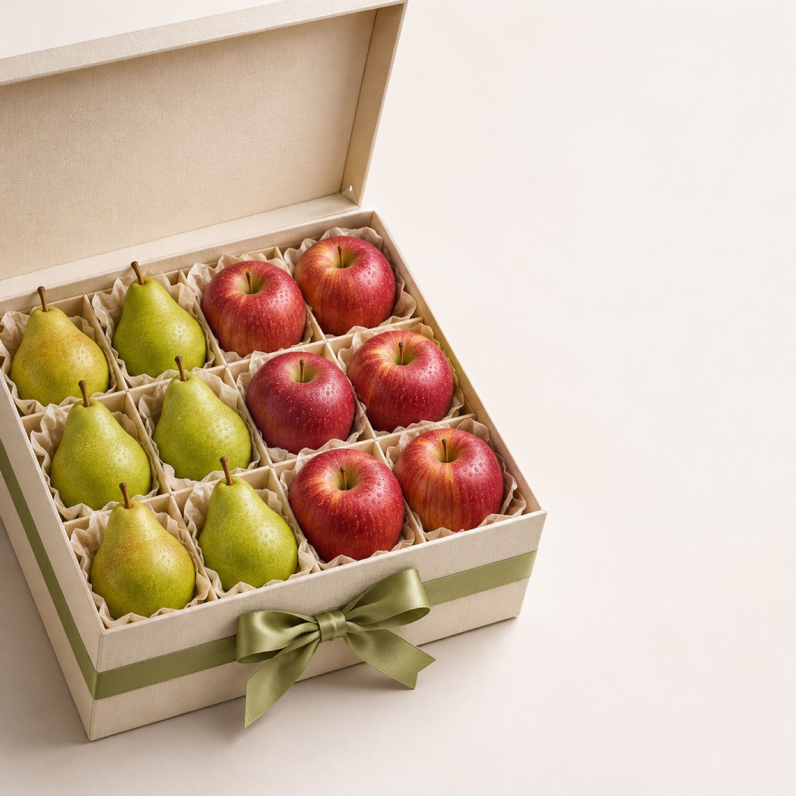
This is a hypothetical example. A photo of a fruit gift box taken at an angle occupies about two-thirds of the layout, with 「お歳暮ギフト」 and the actual product name in the remaining space. A light gray or white background is suggested, with minimal decoration so the fruit colors and packaging are noticed first. Add a short thank-you message beneath the product name. A product-photo-led approach is one of the design directions available for comparison in the reference article; here, it is proposed as a hypothetical layout for your own photos.1
The purpose of this layout is to help viewers quickly assess what the gift actually looks like. Avoid adding quantities or grades that are not visible in the photo through copy alone; use information that matches the actual gift set being sold. In AdForge, choose a reference with a large product photo, then add your actual gift set photo, contents information, and Japanese headline. Of the three generated mockups, prioritize reviewing those in which the box shape and contents match the original photo and the product name remains readable on a small screen.
3. Expressing Thanks with Paper Texture and White Space
This is a hypothetical example. Place a food gift set photo at the lower right of a cream background with a subtle paper texture. At the upper left, set 「大切な方へ、感謝の贈りもの」 horizontally, and use a single thin red line to separate the headline area from the product information. The reference article includes a self-created example using paper texture.1 In this layout, prioritize space around the copy over the amount of decoration. The placement of key information, images, and calls to action, along with white space, is also covered in LY Corporation’s guide to creating banners.4
This layout is an option for ads that emphasize the sentiment behind sending a gift over discounts. A strong texture can make text and product edges less distinct, so request a light, simple background behind the photo. In AdForge, select a reference with similar white space and background colors, then add the product photo and a short thank-you message. Avoid assuming that Japanese-style decorations or vertical text can be edited precisely; inspect the character shapes and product edges in the generated results yourself before choosing a version to use.
4. An Informational Layout with a Separate Shipping Offer Strip
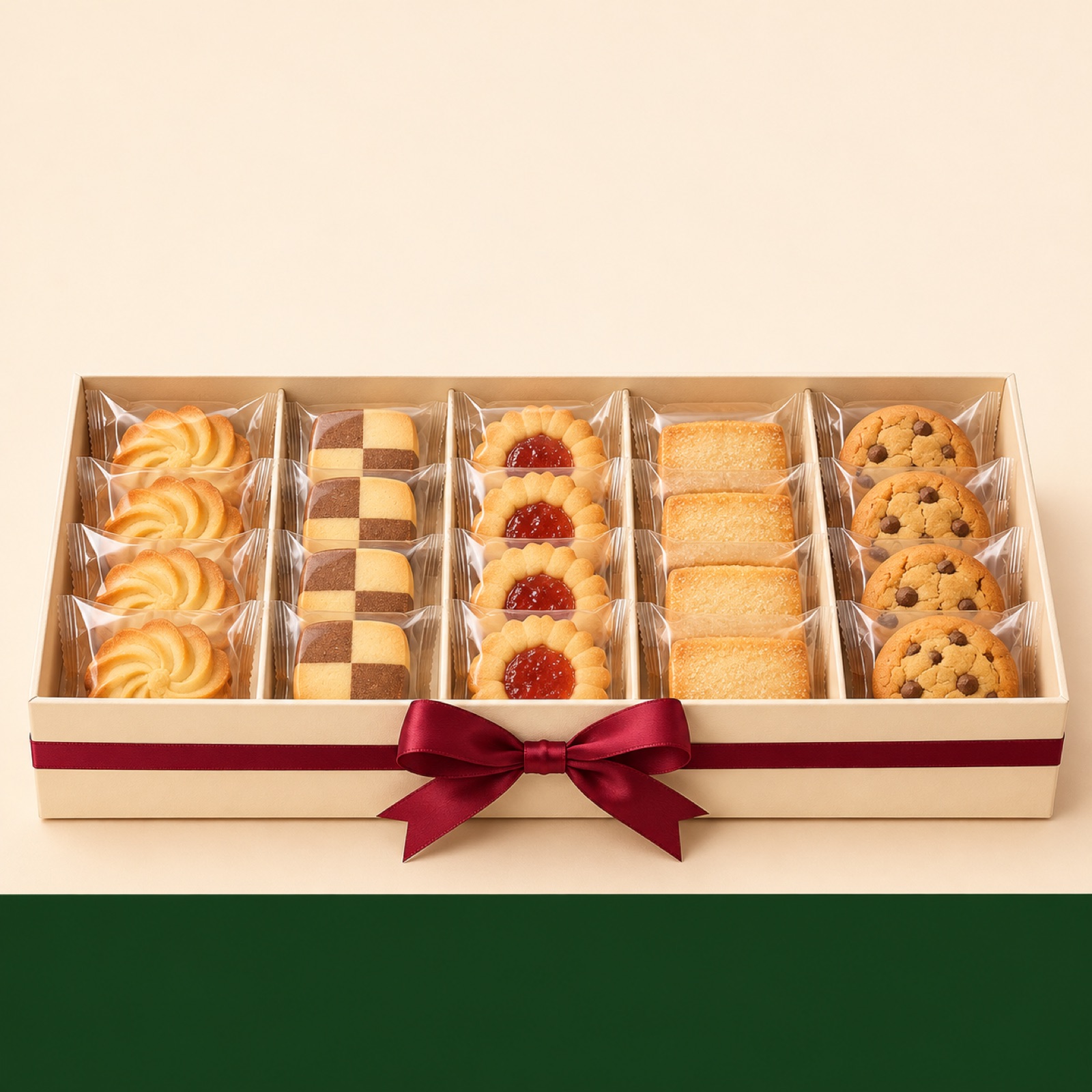
This is a hypothetical example. Place a thank-you headline at the top, a confectionery gift set photo in the center, and a dark green strip containing shipping information at the bottom. Keeping shipping copy off the product photo allows the packaging and contents to remain visible. If you actually offer free shipping, put that message and its eligibility conditions in the same area. The reference design article also describes the process of considering where to place free-shipping copy.1 Here, the shipping strip is a suggestion for helping viewers read verified conditions separately from the product.
This layout can be used for products whose shipping offers matter to the purchase decision. If the offer applies only to certain regions or order values, show those restrictions as well. If the conditions are complex, reconsider which offer to feature in the ad instead of reducing it to one prominent benefit statement. In AdForge, select a reference with an information area at the bottom, then enter your actual product photo and verified shipping copy to create mockups. When reviewing the results, check that the offer has not been left prominent while its conditions are missing or difficult to read.
5. Showing the Order Deadline and Delivery Schedule Separately
This is a hypothetical example. Place a gift set photo on the left, with 「お歳暮のご注文」 and the actual order deadline on the right. Beneath that, provide separate information about either the expected dispatch date or expected arrival date, whichever the seller can verify. The key to this layout is to avoid wording that makes the order deadline and arrival date appear to mean the same thing. Sembikiya-Sohonten’s FAQ explains that Oseibo gifts are now often sent from late November until before Christmas. Do not turn this into a statement about every customer’s preferred delivery date or a delivery guarantee for your own business.5
The steps for creating this in AdForge are as follows. Find and save a reference in the ad library that clearly separates dates from product photos, then review the analyzed layout and colors. On the product information screen, populate the information using the product page address, then check that it matches what you actually sell. In image ad creation, select the reference and product photo to use, then enter the Japanese thank-you message, confirmed order deadline, and shipping information. Review the three mockups generated in one batch for missing dates and altered products, then download the result you want to use. Also verify your rights to use the uploaded materials, and upload the finished creative directly to your ad account.
Key takeaways
Choose an Oseibo image ad layout based on the priority of the thank-you message, product photo, shipping offer, and order deadline. Use actual photos and verified sales information to create three mockups in AdForge, then select the one that communicates your intended information most clearly.
FAQ
Should the thank-you message or the order deadline be larger?
Decide based on the question the ad needs to answer. For creative that helps people choose a gift, lead with the thank-you message and product; for creative that communicates when orders can be placed, lead with the deadline. Instead of enlarging both messages, prepare separate creatives that give each one the lead.
Where can I find Oseibo banner design references?
Look at self-created examples to see the design process, and compare portfolios and seasonal template collections to explore a range of layouts. Lancers has a collection of relevant designs, and Canva has an official collection of Oseibo templates. Inclusion in a collection does not mean that advertising performance has been verified or that every asset is free.123
What should I look for when choosing an Oseibo banner creation tool?
If you want to create mockups using existing product photos and reference layouts, you can consider AdForge’s image ad creation workflow. It creates three mockups with actual product photos, following the reference layout. If vertical text or precise decorative editing is essential, check separately whether the editing capabilities meet your needs.
Which of the three mockups should I use in an ad?
First, check product accuracy, the Japanese copy, dates, and shipping conditions. Then choose the version that makes your intended information—thanks, the product, or ordering details—read first. Comparing mockups alone cannot establish performance. Run the ads and check results in your existing ad management tools.
Make your next ad with AdForge
AdForge (ad-forge.io) is an ad remake app: pick an ad you like and rebuild it as a video or image ad for your own product. Find references in the Meta and TikTok ad libraries, let AdForge write the script, AI narration and captions, then review and download. Every account starts with 12 free image ads.