5 Ugly Image Ad Examples Using Product Photos and Short English Copy
Explore five ugly image ad layouts you can try even without professionally shot product photos. Includes English copy and placement for hypothetical concepts, plus the steps to create versions featuring your own product in AdForge.
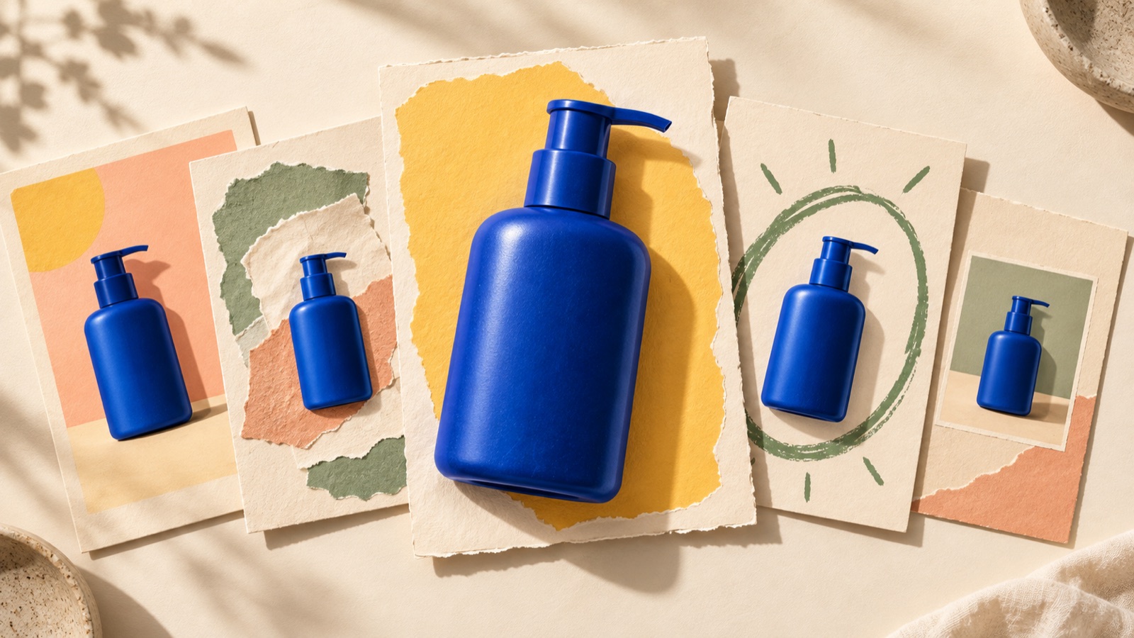
To create an ugly image ad, try adding short English copy to a single product photo, or placing a small product image in a layout that reads like a note. Text-heavy layouts and product photos taken on a phone are described as approaches to this type of ad.3 Here, “ugly” refers to layouts with fewer decorative elements and less rigid alignment. All five examples below are hypothetical. Choose a layout that suits your existing photos and use it to create your first three concepts in AdForge.
1. A Casual One-Liner on a Desk Photo
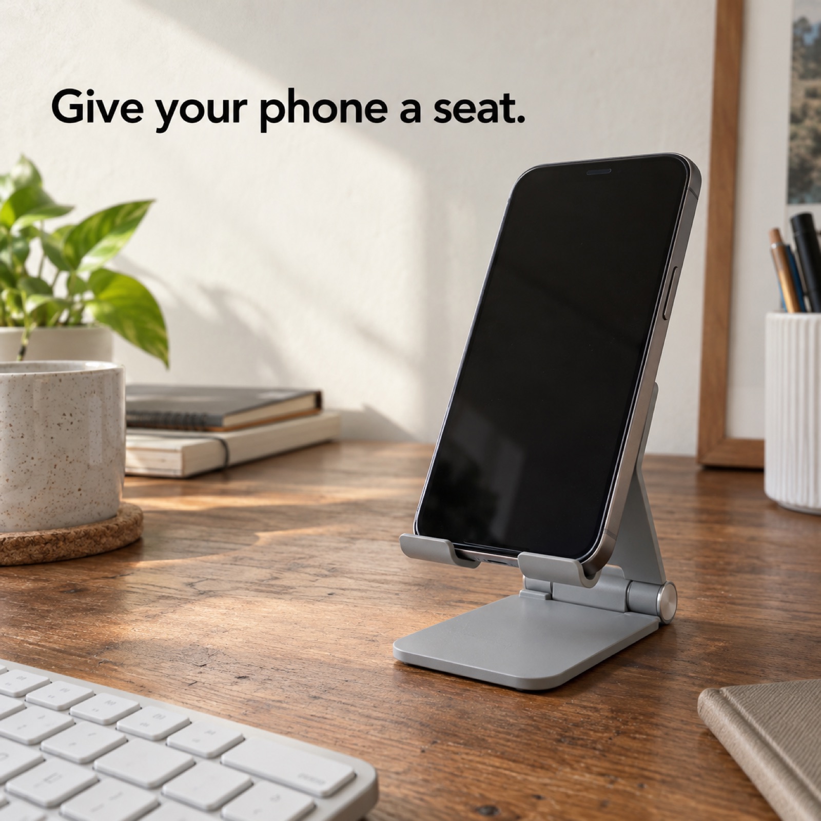
This is a hypothetical example. Use a photo of a foldable phone stand on a desk as the full background. Leave only something like the edge of a keyboard in the background. Add “Give your phone a seat.” in black in the empty space at the upper left, with “Meet your desk stand.” in smaller text below. Focus on the setting in which the product is placed rather than retouching shadows or adding decoration. The aim is to communicate what the stand does through a brief joke and the photo together.
To adapt this for your product, choose an existing photo that shows where it is used. There is no need to deliberately take a blurry photo to create an ugly look. The product’s outline and orientation in use should be visible. In AdForge’s ad library, find and save image ads that use product photos and short copy. Review the layout and color analysis of the saved ads, then use your chosen reference, your product photo, and your English message to create three image concepts. Reject any concepts where background props draw attention before the product, then download your selections.
2. A Note That Looks Like a To-Do List
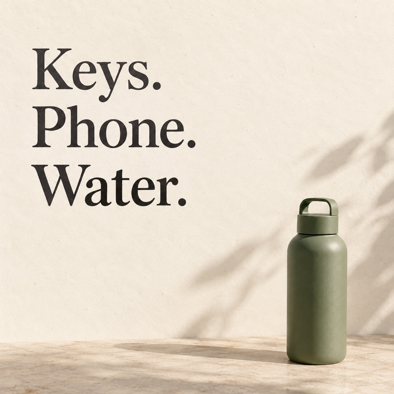
This is a hypothetical example. Put “Before you leave:” in large text on a cream background, followed by “Keys. Phone. Water.” with each item on its own line. Place a small photo of an actual water bottle at the lower right. A less polished presentation resembling a notes app is described as one approach to ugly ads.2 This example borrows the brevity of a note rather than copying an app screen exactly. The layout aims to convey that the product is something to take when heading out, without requiring a lengthy product description.
For your product, use an action your customers actually take. For a lunch box, you could describe getting ready with “Lunch. Fork. Ready.” Do not add names, dates, or star ratings that could make it look like a customer’s note or review. Choose a text-heavy image ad as a reference in AdForge, then enter your product photo and the English copy you want to use to create concepts. Check the results for line breaks, English spelling, and whether the small product photo is recognizable. If the copy gets too long, remove an action rather than adding another sentence.
3. A Doodled Arrow Pointing Out One Detail
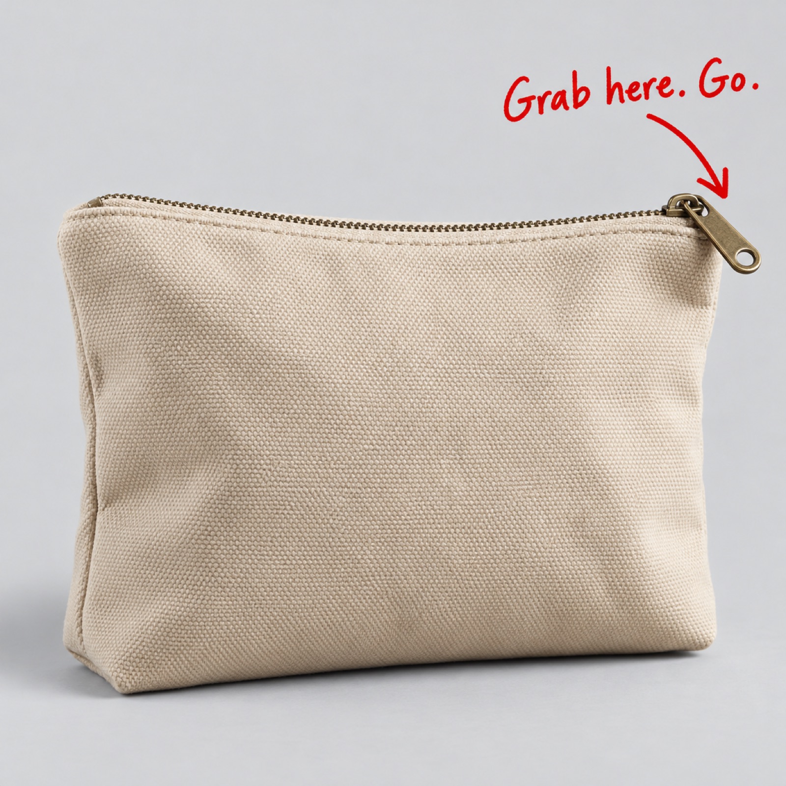
This is a hypothetical example. Place a large photo of a fabric pouch in the center of a light gray background. Draw a single red, hand-drawn arrow toward the zipper pull and add “Grab here. Go.” Include no other explanation. The aim is to connect the detail the arrow points to with the meaning of the copy at a glance. This only works if the pull is clearly visible in the actual photo. Adding copy about storage capacity or durability that the photo does not show lets the claims get ahead of the evidence, even in a simple layout.
To adapt this for your product, choose just one detail to point to. Elements that can be confirmed in a photo, such as a handle, an adjustment dial, or a folding section, work well. In AdForge, choose an image reference with a similar arrangement of doodles and product photography, then add an actual photo that clearly shows the detail, along with your selling point. Review the three generated concepts to check that the arrow points to the right place and that the product’s shape or lettering has not changed. Do not use results where the doodle covers the product or emphasizes the wrong part.
4. A Big Question Above a Small Product Photo
This is a hypothetical example. Fill most of the upper portion of a pale yellow background with “Where did that cable go?” in black. Near the bottom, place a small actual photo showing a cable organizer clip together with a cable. Use large text but only one typeface. Text-heavy layouts can serve as a reference format for ugly ads.3 Here, a familiar question draws attention, while the small photo provides the answer. The selection criterion is whether the photo alone makes the connection between the question and the product clear.
To apply this to your product, write down one sentence a customer might say just before using it. A question directly connected to the product is easier to work with than a vague “Want a better life?” In AdForge, choose a reference combining large copy with a small product photo, then add your question and product photo to create concepts. View the results at a small size on a phone to check that the question reads smoothly without awkward breaks. When testing this layout, keeping the product photo and background color the same while changing only the question makes it easier to record which questions you compared.
5. A Product in the Corner, With Space to Speak
This is a hypothetical example. Place a photo of a silver business card case at the lower right of a navy background, with only “Cards. In one place.” at the upper left. Leave plenty of empty space instead of centering the product. Practitioners have also asked how to preserve a brand’s image when applying ugly ads to premium products.1 This example preserves the texture in the photo and the brand color while reducing decoration and rigid alignment. For a premium product, it can serve as a starting point for deciding how much to strip back.
To create this for your product, first choose one existing brand color and a clear product photo. Save an image ad with plenty of empty space in AdForge and review its layout and color analysis. At the product information step, populate the information using the product page address, then check the selling points and English message needed for this ad and upload an actual photo. Review the three concepts created from the reference and download the ones where the product is not too small. Check that you have the rights to use the uploaded materials, then upload the finished files directly to your existing ad management tool to run the ads and review performance.
Key takeaways
Choose a lifestyle photo, note, arrow, big-question, or empty-space format based on the photos you have. Decide on short English copy connected to the product, create three image concepts in AdForge, and select the clearest layout as the creative for your first test.
FAQ
Do ugly image ads need to look deliberately badly made?
The examples in this article reduce decoration, alignment, and the amount of explanation. If the product is blurry or the English copy is hard to read, the message gets lost too. Make the connection between the product in the photo and the copy immediately clear.
Which example should I try first?
If you have a photo showing where the product is used, start with the desk photo format. If you have a product photo with an uncluttered background, start with the note or big-question format. The arrow format is easy to apply when the detail you want to emphasize is clearly visible in the photo.
Do ugly ads perform better than polished ads?
The sources cited here are not enough to support a general claim that they perform better. Treat them as introductions to less polished approaches and suggestions for comparative testing.2 Run them alongside your existing creative, then evaluate them using metrics aligned with the same campaign objective.
Can I treat the three concepts AdForge creates as an ad test right away?
The three concepts are production drafts to review first. If the photo, copy, and layout all change together, it is difficult to tell what affected the results. Decide which element you want to compare, then select and download your creative. Upload the ads, configure campaigns, and review performance directly in your existing ad management tool.
Make your next ad with AdForge
AdForge (ad-forge.io) is an ad remake app: pick an ad you like and rebuild it as a video or image ad for your own product. Find references in the Meta and TikTok ad libraries, let AdForge write the script, AI narration and captions, then review and download. Every account starts with 12 free image ads.