5 Beauty Ad Image Examples for Karrot: Layouts That Work with Your Product Photos
From lip tints to haircare sets, these hypothetical examples show how to arrange products and offers around the photos you have. Each includes steps for turning the layout into image concepts in AdForge.
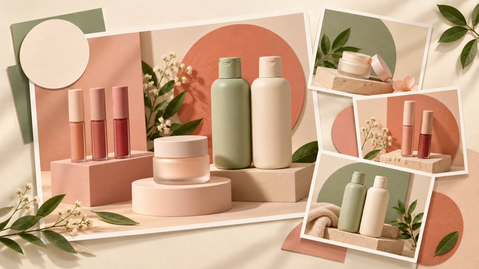
If you are looking for beauty ad image examples for Karrot, start by choosing a purchase question your existing photos can answer. For products where color matters, put color swatch photos at the center. For unfamiliar products, focus on the order of use. For portable products, show a scene that helps shoppers judge their size. All five examples below are hypothetical. You can compare the placement of photos and copy, then follow the steps to turn your chosen layout and real product photos into three concepts in AdForge.
1. Lip Tint Color Selection Layout
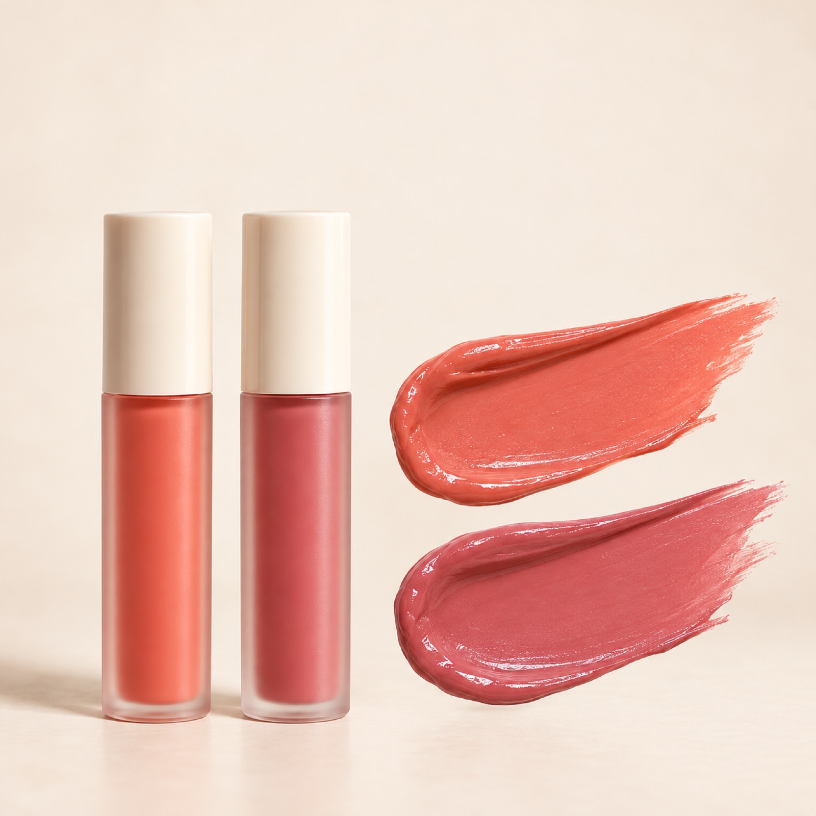
This is a hypothetical example. If you sell two lip tint shades, place a large photo of the actual packaging on the left and two equally sized color swatch photos you have taken on the right. Start the copy with a single choice-based question, such as “Which shade will you choose today?” Place each shade name directly beside its swatch photo. The purpose of this layout is to reduce the need for shoppers to guess the product’s color from its packaging alone. Karrot’s official training materials also cover product strengths and the composition of photos and titles.2
To apply this to your product, first check that the photos you have clearly show the difference between the shades. In AdForge, choose a reference for an image ad, enter the product name and the features of each shade in the product information, and upload real product photos. In the message field, enter “Show the product and color swatches side by side.” Check that the shade names match the photos and that the packaging shapes are accurate in the three concepts generated from the reference layout, then download them. If you do not have color swatch images, it is better to leave out copy that makes definitive claims about the color based on packaging photos alone.
2. Haircare Usage Order Layout
This is a hypothetical example. If you are introducing a shampoo and a hair mask together, place the two containers side by side in the center, with “Cleanse” and “Finishing care” beneath the respective products. Keep the background simple, with the feel of bright bathroom tiles, and place “Two products, in this order” at the top. This layout explains each product’s role before presenting a set discount. The goal is to help shoppers understand which products to use together, even if the combination is new to them. Always adjust the actual order of use to match the product instructions.
If your products are a shampoo and a scalp tonic, simply replacing the product names is not enough. You need to revise the descriptions and arrangement according to whether each product is rinsed out or used after drying. In AdForge, choose a reference that shows the two products distinctly, then add real photos and each product’s role to create three concepts. Check the results to make sure the containers have not been swapped and no extra items have been added. This approach of putting usage instructions at the center of the message draws on the ad elements covered in Karrot’s official training materials.2
3. Hand Cream Pouch Scene Layout
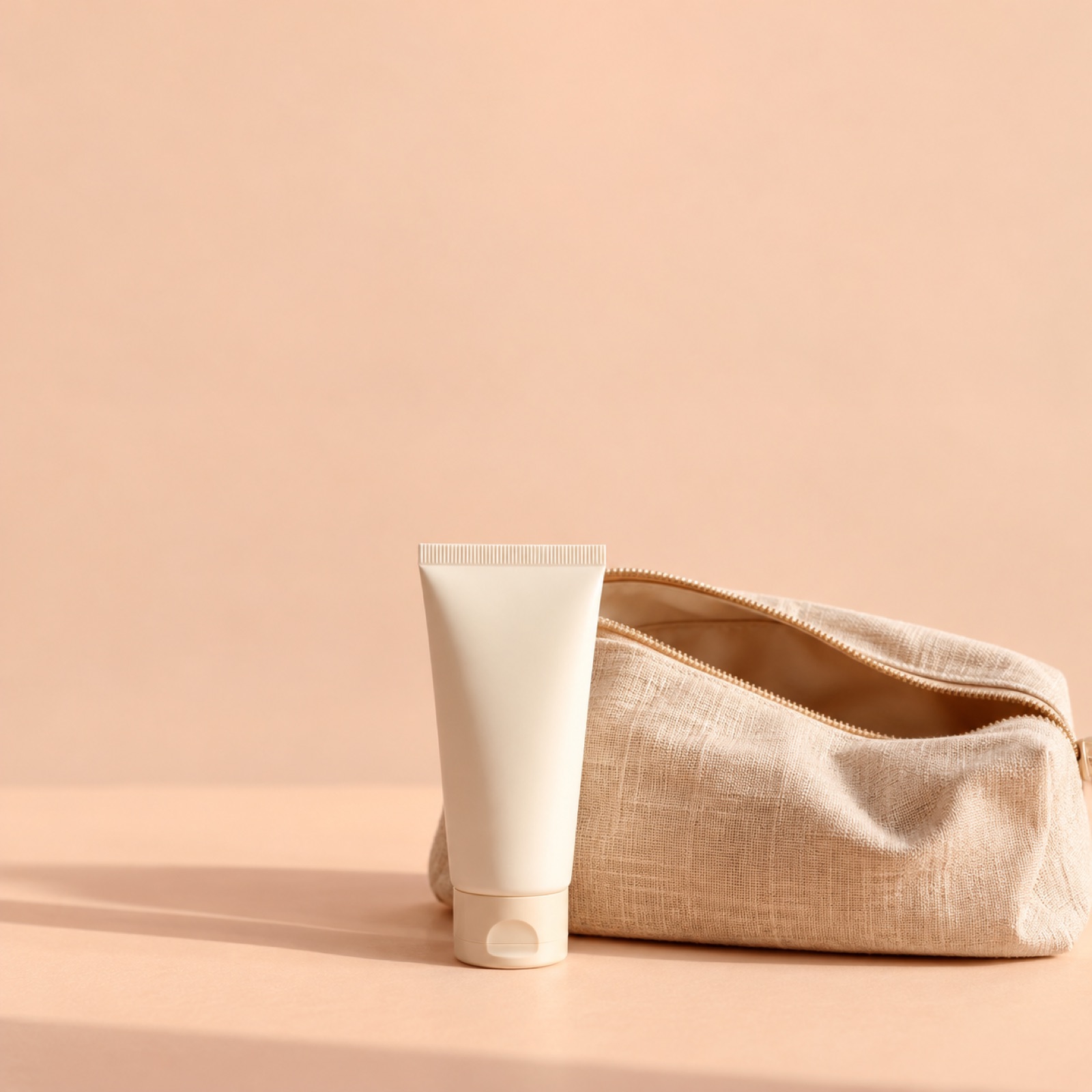
This is a hypothetical example. If you are introducing a small hand cream, use a real photo you have taken of the product beside an open pouch as the main image. Make the product large enough to see clearly in the lower part of the image, and place “Hand cream to keep in your bag when you head out” in the empty space above. This layout shows a situation in which the product is carried, rather than relying on a standalone product photo that gives no sense of size. Choose a pouch that is less visually prominent than the product, since it is a prop that provides context. Avoiding arrangements that make the prop look like a free gift helps keep the message clear.
When adapting this to your product, check that it actually fits inside the pouch and keep other objects in the photo to a minimum. In AdForge, choose a reference that places a product and short copy in an everyday scene, then enter your actual photo and the situation in which the product is carried. When comparing the three generated concepts, first check that the product has not become too small. Image quality and text readability, both covered in Karrot’s official creative guide, are also items to check.1 Prioritize concepts in which both the product and the copy are clear on a small screen.
4. Cleanser Volume Comparison Layout
This is a hypothetical example. If you sell a small size and a full size of the same cleanser, place photos of the two products taken under identical conditions side by side. Write the actual volume beneath each one, and place “A size to try, a size to keep at home” at the top. Arrange the photos to convey the products’ actual relative sizes rather than forcing both images to the same height. This example puts the basis for choosing ahead of discounts. However, do not automatically label the small size as a travel size or add an unsupported estimate of how long the full size will last.
To apply this to your product, first check the volume and sales unit in the product information. In AdForge, choose a reference that compares two options, then add real photos, the volumes, and a short description for each option to create concepts. Check that the numbers are paired with the correct products and that the size proportions do not create a misleading impression. If you sell only one size, it is better to choose another example than to force this layout to fit. A comparison layout has a clear purpose when customers have actual options to choose from.
5. Makeup Brush Set and Bonus Offer Layout
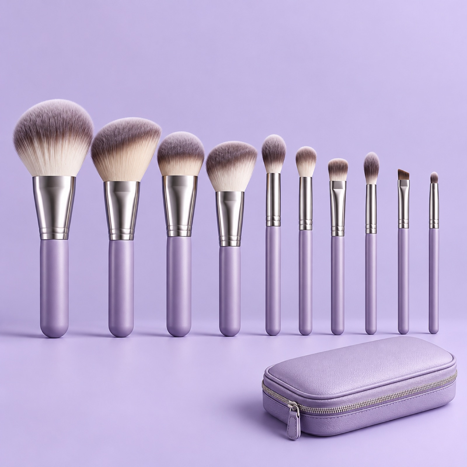
This is a hypothetical example. If you are actually running a promotion that includes a storage case with the purchase of a brush set, lay out all the brushes being sold in the center and place the case separately at the lower right. Use “A brush set, complete with a storage case” as the headline. Add brief eligibility terms beside the case to distinguish the standard contents from the promotional offer. This layout shows what shoppers receive instead of presenting a discount percentage. Karrot’s official training materials explain the basis for using offers as an advertising message.2
For your product, first confirm whether a promotion is running and how many items are included. If the case is sold separately, remove the offer copy and show only the items available for purchase. In AdForge, choose a reference with separate areas for the product bundle and the offer, then add photos of the actual items and the confirmed terms to create three concepts. Download the images you have reviewed, then register and run your Karrot ads separately. AdForge does not have a feature that automatically runs ads through your ad account. For your first creative, start with the layout that makes the relationship between the product and the offer clearest using the photos you already have.
Key takeaways
Build your Karrot beauty ad image around one thing customers want to know: color, usage order, portability, volume, or included items. Choose a layout you can support with real photos, create three concepts in AdForge, then download the reviewed results and upload them directly to Karrot Ads.
FAQ
Which Karrot ad image layout should I start with?
Consider both the photos you have and the questions customers ask before buying. If you have color swatch photos, choose the color selection layout. If you need to explain the roles of multiple products, choose the usage order layout. Do not start writing copy for a layout you lack the visual evidence to support.
Do I need offer copy when creating a Karrot ad banner?
In the examples in this article, color, usage order, portability, and volume can provide reasons to choose a product even without an offer. Choose the offer layout only when an actual promotion is running, and include its terms.
Can I search directly for Karrot ad references in AdForge?
The available ad library search covers Meta and TikTok. You can find ads to reference for product placement or color schemes, create image ads using your product information and real photos, then review them for submission to Karrot.
How should I choose among the three concepts?
Compare whether the products are immediately distinguishable, the key copy is readable, and the photos and descriptions match accurately. Image quality and text readability are also covered in Karrot’s official creative guide.1 Your final review should also include checking your rights to use the uploaded materials.
Make your next ad with AdForge
AdForge (ad-forge.io) is an ad remake app: pick an ad you like and rebuild it as a video or image ad for your own product. Find references in the Meta and TikTok ad libraries, let AdForge write the script, AI narration and captions, then review and download. Every account starts with 12 free image ads.