5 GFA Ad Creative Examples: Finding References and Arranging Images and Copy
Planning a GFA image ad gets easier once you decide whether to lead with the product, the offer, or a usage scenario. Compare image and copy placement across five hypothetical examples, then learn the steps for creating concepts with your own product.
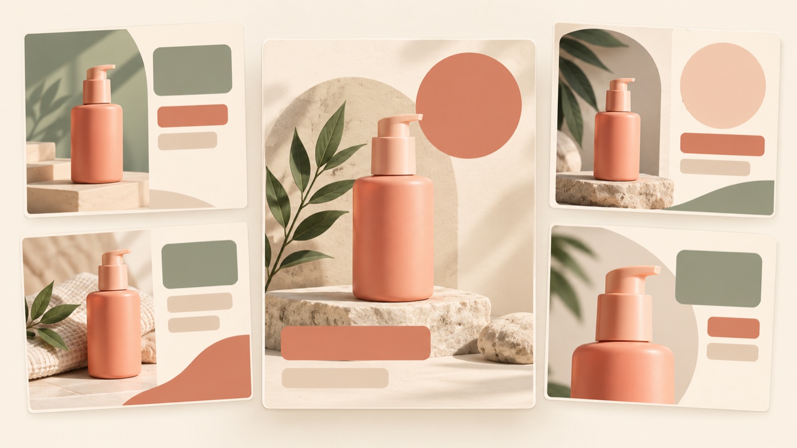
If you’re looking for GFA ad creative examples, start by comparing five approaches: product-led, offer-led, problem-led, usage-led, and informational. The five examples below are hypothetical, not ads that have actually run. If you’re also wondering where to find references, practitioners have asked about alternatives to existing display ad reference sites.1 You can use AdForge’s Meta and TikTok ad libraries to find image composition references, then check Naver’s official guides separately for the specifications that apply to GFA. Naver’s official materials include guidance on 1:1 image banners for use on both desktop and mobile.2
1. Product-led: For products whose form is a reason to buy
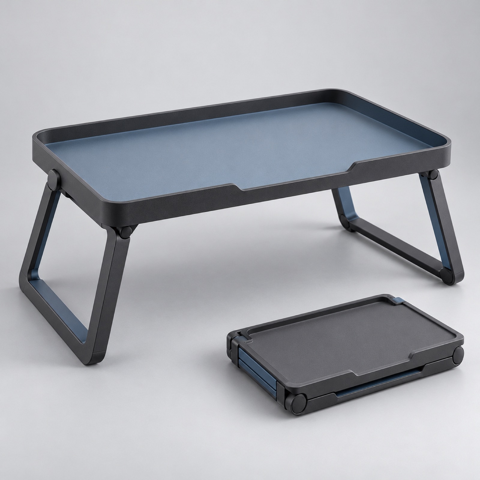
This is a hypothetical example. Place a large image of a folding desk tray in the center of a light gray background. Make the unfolded product the main image, with a smaller image of it folded in the lower right. Put the line “Unfold it to organize. Fold it flat to store.” in the upper left. This layout is intended to help viewers understand the product’s form and how it is stored in a single image. It is worth considering when the item itself, rather than decoration, is the reason to choose it. If the two photos are similar in size, they may compete for attention.
When adapting this to your product, first check whether you have photos showing it in different states. Choose a combination that answers questions shoppers have before buying, such as closed and open views, or an overall view and a detail shot. In AdForge, select a reference with a large product image and a smaller supporting photo, then add your actual product photos and the feature you want to highlight to create three image concepts. Check the product’s shape and color in the results, along with what the supporting photo communicates. Keeping the message consistent and looking first at product size and spacing makes the concepts easier to compare.
2. Offer-led: A layout that gets the offer read first
This is a hypothetical example. Assume a stationery store wants to promote a bundle it actually sells. On the left side of a cream background, place the large headline “Three notebooks in one bundle.” On the right, lay out all three notebooks without overlapping them. Add brief purchase information below. This approach connects the offer to the actual contents so viewers understand what they will receive. Even without grounds for leading with a discount percentage, you can explain the bundle itself, but mentioning items that do not appear in the photo can cause confusion.
For your own product, include only the bundle contents and terms currently available for sale. If you include a price, check it against the actual sales information and make sure any necessary conditions are not buried in small text. In AdForge, choose a reference with separate areas for copy and products, then enter photos of the bundle contents and the verified offer details. In the three generated concepts, check whether viewers can read the headline and then confirm the contents in the photo. If the offer copy becomes long, trim decorative wording and organize the core offer and purchase conditions separately.
3. Problem-led: Connecting a frustration to the tool that solves it
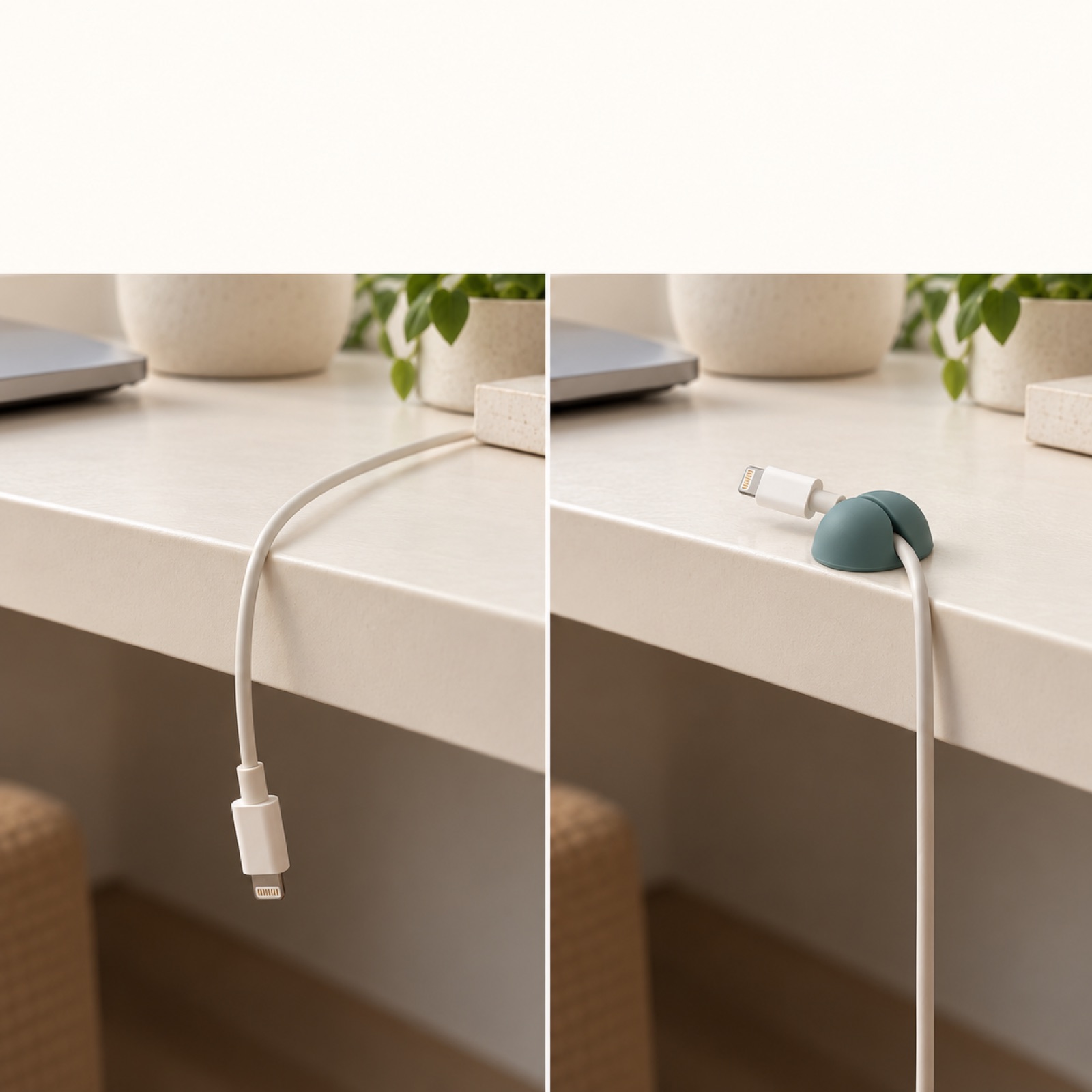
This is a hypothetical example. For a cable organizer clip ad, place a photo of a charging cable that has slipped below a desk on the left and a photo of the cable held in the clip on the right. Above them, ask “Charging cable slipped under the desk again?” and place the product name near the image showing the solution. This layout starts with a familiar frustration rather than the name of an unfamiliar product. The difference between the two photos can help explain the product’s role, but large differences in camera angle or lighting can make it hard to see what has changed.
When making this with your own product, choose just one frustration it actually solves. For an organizer clip, showing its specific role in holding a cable in place is clearer than saying it “makes your desk perfect.” In AdForge, select an image reference with a left-and-right comparison, then add your before-and-after materials and selling point to create three concepts. Check whether the connection between the cable and clip looks natural and whether the copy claims a greater effect than the photos show. If you have only one photo, a product-led layout is a better choice than forcing a comparison.
4. Usage-led: Showing the moment a customer will use the product
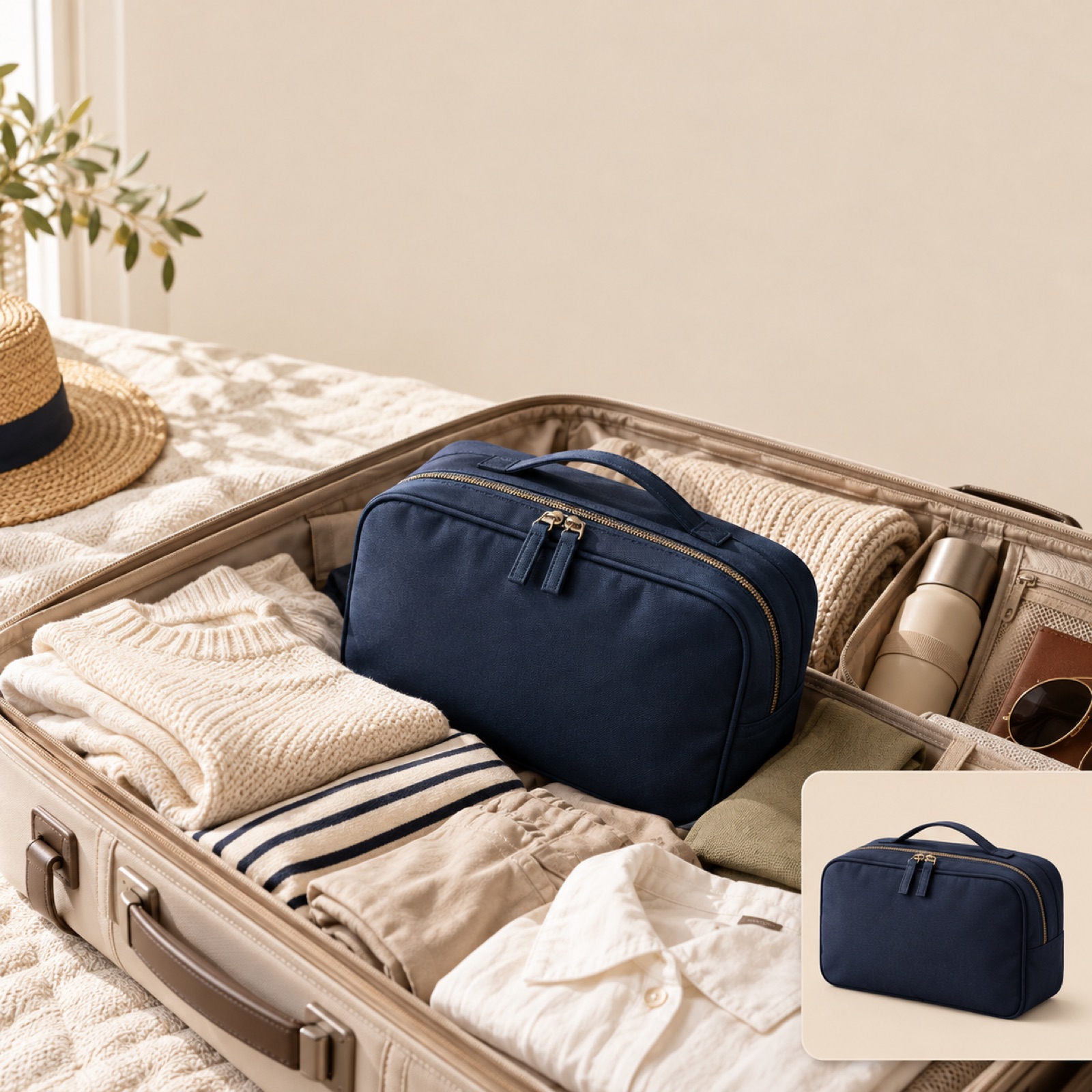
This is a hypothetical example. Photograph a travel pouch inside an open suitcase, then add a small standalone photo of the pouch on one side near the bottom. Place the line “Weekend essentials, all in one place” in the space at the top. Keep the background simple with beige and dark navy. This layout is intended to help viewers imagine where and how they would use the product. It suits products whose usage context matters, but too many surrounding props can make it unclear which product is for sale.
For your own product, use locations and objects that reflect how customers actually use it. Avoid props that could give a misleading impression of capacity or size. If the product gets lost in the background, choose a reference with a larger standalone product photo. In AdForge, select a layout that combines a lifestyle scene with a product photo, then add actual photos you have permission to use and your message. When reviewing the three results, first check whether the product is identifiable, then whether the usage scenario is clear. Give lower priority to concepts that create a nice mood but leave the product hard to see.
5. Informational: Brief answers to questions shoppers ask before buying
This is a hypothetical example. Place a photo of a desktop organizer on the left. On the right, add the headline “Want separate compartments?” alongside a photo of its removable dividers. Below, briefly list only features you have actually verified. For products whose structure shoppers need to understand before buying, a concrete answer can be more useful than emotional copy. Too many features, however, can make the ad as cluttered as an instruction sheet, so this example explains just one structural feature: removable dividers. Start with one question your customers frequently ask about your own product, too.
To create this example in AdForge, go to the reference selection screen and choose an image with an explanatory area beside the product photo. Use the layout and color analysis of saved image ads to review the balance between photos and copy. At the product information step, upload an actual photo of the organizer, then enter the verified feature—removable dividers—and the message you want to use. You can also paste the product page address to fill in the product information automatically. Generating the image ad produces three concepts that follow the reference layout and use your actual product photos.
On the results screen, review the product’s form, the accuracy of the copy, and how well the photos match the explanations, then download the creative you select. You also need to confirm that you have permission to use the uploaded materials. Next, check the detailed specifications for your intended placement in Naver’s official production guide and the design guide linked from it.2 Separately compare the creative downloaded from AdForge against those specifications, then use your existing ad management tools to upload and run it. For your next round, comparing product-led and informational layouts using the same product information will make it easier to decide how much explanation to include.
Key takeaways
For GFA image creative, start by deciding whether to showcase the product, get an offer read, or answer a question shoppers have before buying. Apply actual product photos and your message to a reference that fits that purpose, compare three concepts, and prepare the creative for upload according to Naver’s official specifications.
FAQ
Where can I find GFA ad references?
This article uses AdForge’s Meta and TikTok ad libraries as sources of image layout references. It does not present them as a way to search for ads running on GFA. Use layouts found on other platforms as references, but check Naver’s official guides for the actual production specifications.2
Which example should I start with?
Start with a product-led layout if the product’s appearance is a reason to choose it, or an informational layout if you need to explain how it works. Keeping the product and message consistent while comparing the balance between photos and explanation makes it easier to judge which layout is clearer.
Are images created in AdForge uploaded directly to GFA?
You need to download the finished creative and upload it yourself. Do not assume it automatically meets the specifications for each GFA placement; compare the output separately against Naver’s official design guide.2
How should I choose between the three concepts?
Prioritize a concept that shows the product accurately, makes the key copy easy to read, and matches the sales information. Creative quality and ad performance should be assessed separately. Use your existing ad management tools to check performance after the ad runs.
Make your next ad with AdForge
AdForge (ad-forge.io) is an ad remake app: pick an ad you like and rebuild it as a video or image ad for your own product. Find references in the Meta and TikTok ad libraries, let AdForge write the script, AI narration and captions, then review and download. Every account starts with 12 free image ads.