5 Skincare Banner Ad Examples: Product, Set, and Price Layouts
The layout of a skincare banner for the Japanese market depends on what you want people to notice first. Compare product size, set contents, and pricing priorities through five hypothetical examples, then follow the steps to create mockups for your own products.
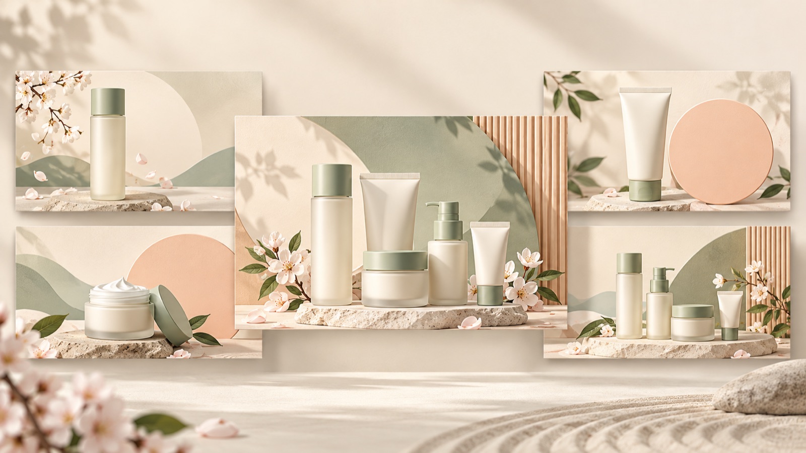
If you are looking for skincare banner ad examples, first decide what viewers should understand first: what a single product looks like, what a set contains, or how much it costs. Start by making the product photo large for a single item, showing the contents together for a trial set, or placing the amount and purchase terms close together for a price-focused ad. All examples below are hypothetical. Drawing on centered product layouts and displays of prices and first-purchase offers found in Japanese cosmetics banner references, they suggest specific layouts you can apply to your own products.2
1. Centered Product: A Hypothetical Example Featuring One Large Serum Bottle
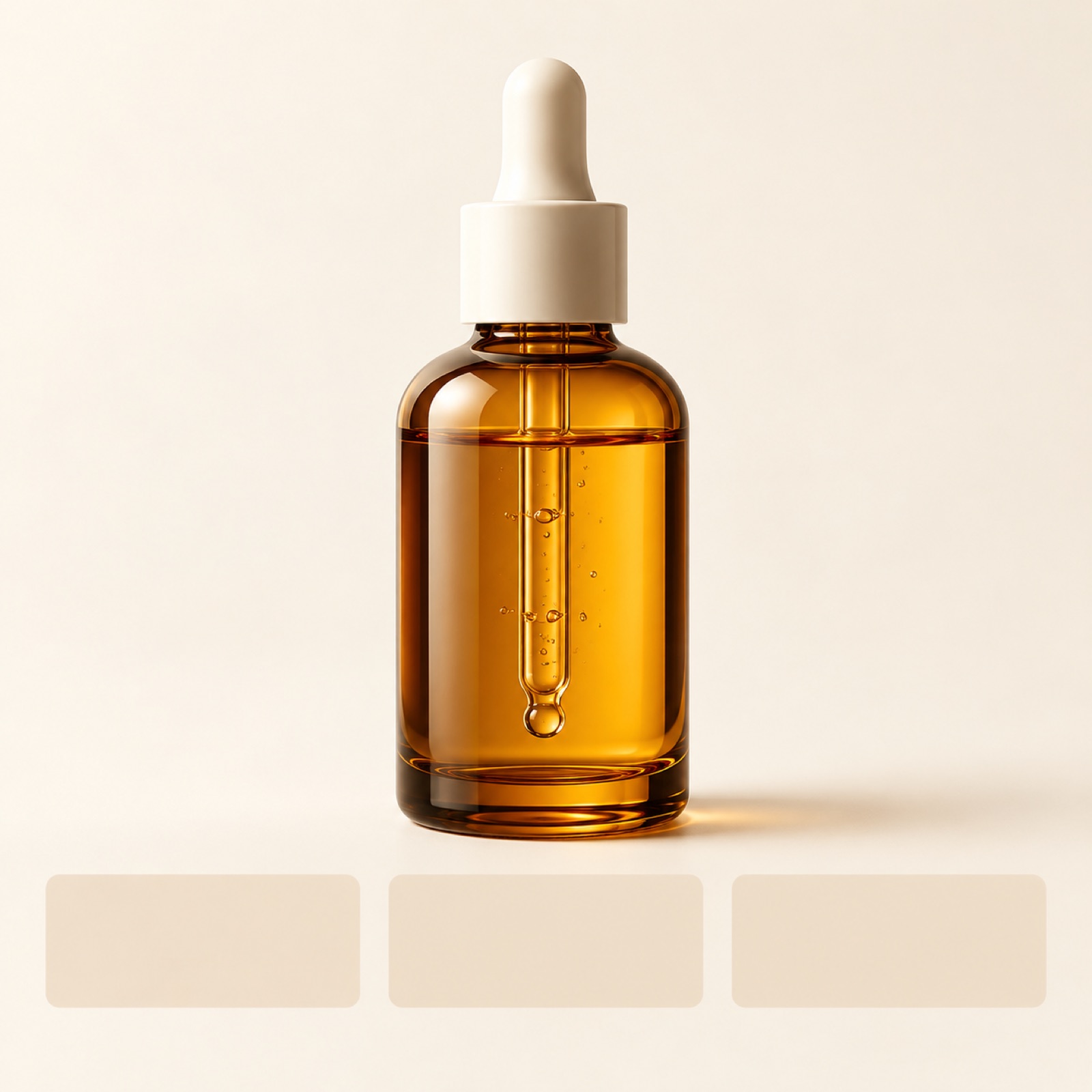
For a banner introducing a single serum, try making the product photo the focal point. In this hypothetical mockup, one large serum bottle sits in the center of a pale ivory background. A short headline, “One Serum for Everyday Use,” appears at the top, with the actual volume and “View Product Details” at the bottom. The price appears in smaller type beneath the product name. Centered product layouts also appear in collections of Japanese cosmetics banner references.2
The goal of this layout is to help viewers recognize the product’s shape and name first. Instead of crowding a small bottle with explanations, leave space around the product to give the eye somewhere to rest. When adapting it to your own product, start by checking the container’s proportions and label legibility. Choose a centered-layout reference in AdForge, add your actual product photo and product information, and generate three image mockups. Then select the layout that shows the product most clearly.
2. Set Lineup: A Hypothetical Example Showing the Trial Set Contents
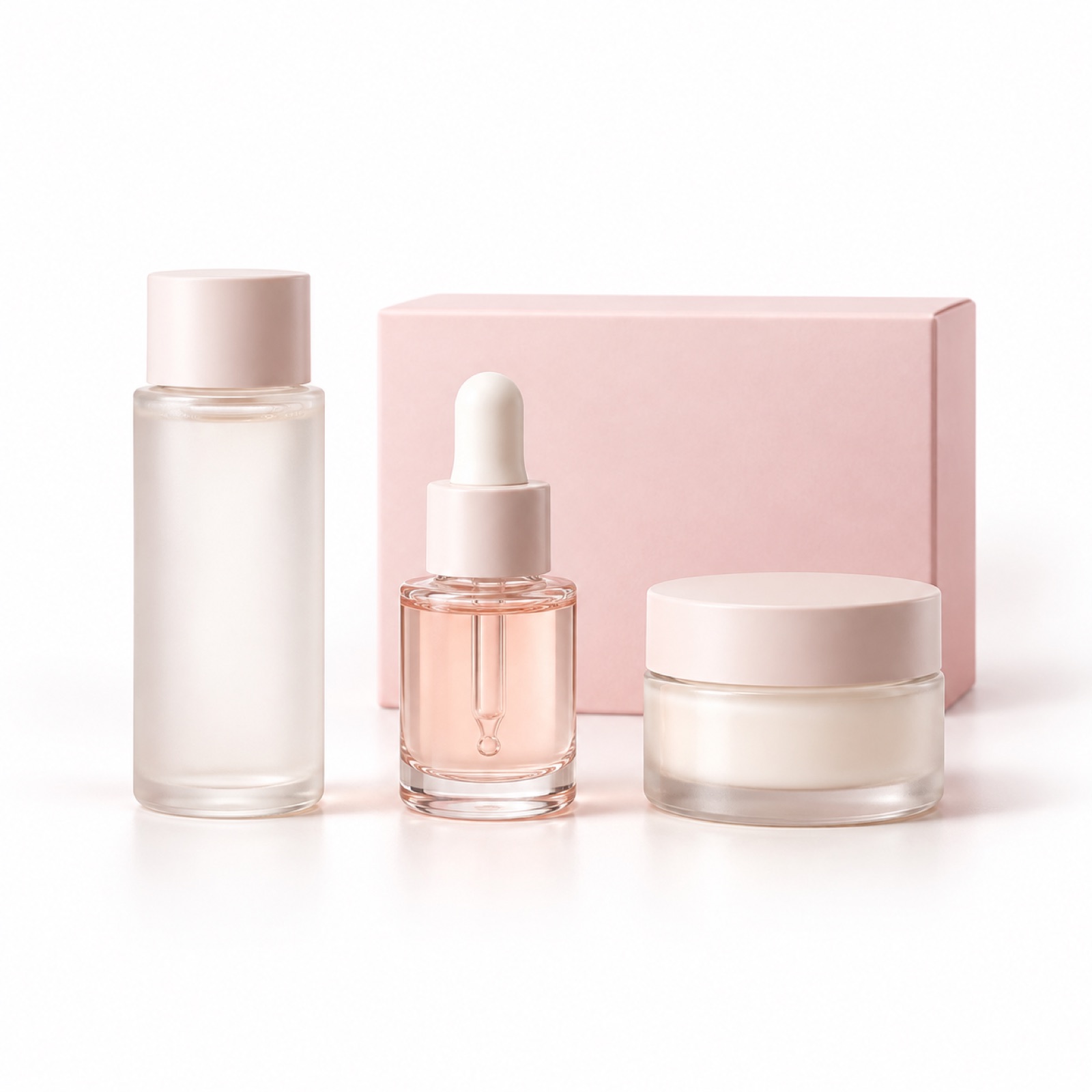
Showing only a large box makes it difficult to tell what a trial set contains. In this hypothetical mockup, toner, serum, and cream sit in a row on a white background, with a smaller box behind them. Each product has its name and actual volume below it. The headline, “Three-Piece Trial Set,” appears at the top, with the set price at the bottom. Product placement, set contents, and price legibility were also discussed in a banner improvement question posted by an actual creator.1
This layout aims to keep shoppers from having to guess what is included. Leave enough space between the containers so they do not overlap and can be seen as individual items. When adapting it to your own set, distinguish the actual included products from gifts with purchase, and check whether every object shown in the photo is included in the purchase. Add actual photos of the contents and accurate item information to AdForge, then review the output to ensure the number of containers, their relative sizes, and the description of the contents agree.
3. Price Focus: A Hypothetical Example Placing the Amount Beside the Purchase Terms
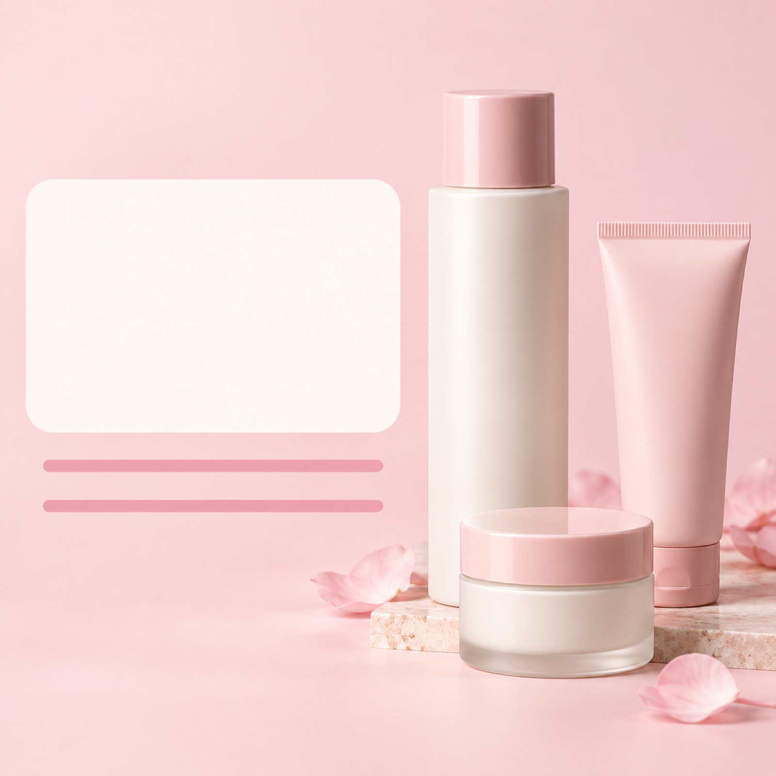
If price is central to the purchase decision for a trial product, try placing pricing information on the left and the contents on the right. In this hypothetical mockup, “Trial Set” and the selling price appear prominently on the left of a pale pink background, with shipping costs and applicable terms grouped directly below. An actual photo of the set appears on the right. Japanese cosmetics banner references include examples displaying prices and first-purchase offers.2
When the price is large but the terms are far away, it can be difficult to understand which purchase the amount applies to. When adapting the layout to your own product, clearly state whether the offer applies to a regular purchase or a first purchase, based on your actual sales terms. This example does not use an arbitrary discount rate or amount. Enter the confirmed price and terms in AdForge, then compare the generated output with the product page. Review not only the amount but also how taxes, shipping costs, and purchase terms are presented.
4. Split Layout: A Hypothetical Example Giving the Product and Copy Separate Spaces
If the product photo and copy compete for attention, try dividing the banner into two areas. In this hypothetical mockup, the left half has a pale teal background and a cream container. The white area on the right presents the product name, one verified feature, volume, and price from top to bottom. The call to action sits at the bottom right. Design references also discuss comparing the feel of banners through color schemes, fonts, and layouts.3
This layout separates the space for viewing the product from the space for reading information. For Japanese copy, adjust sentence length so the product name and price are easy to read first, rather than simply shortening a translation to fit. Choose just one substantiated feature of your product. Check the output created from a split-layout reference in AdForge on a small screen as well. If the text becomes crowded, prioritize removing explanations that are not essential.
5. White Space Focus: A Hypothetical Example of Creating Three Product Mockups in AdForge
The final hypothetical example keeps just one cream product and a short headline. The product sits near the bottom of a warm beige background, with the headline and ample white space above. Price and volume are grouped beside the product. With less information, it is easier to compare the balance between the product photo and text. Do not treat white space itself as a formula for a premium feel. Use it as a reference for examining the overall mood created by the photography, colors, and copy together.3
Search for skincare ads in AdForge’s Meta and TikTok ad libraries, and save references with the white space and product placement you want. Review the layout and color analysis of the saved ads, then add your product photo and message in the image ad creation tool. If you automatically filled in information using a product page address, check that content too. AdForge creates three mockups using the reference layout and actual product photo. Review the results and download your chosen creative.
Compare the three mockups by checking whether the product stands out first, the headline is easy to read, and it is clear which product the price applies to. Also compare the container shape and label, Japanese copy, and sales terms with the original materials. Users must confirm that they have the rights to use uploaded photos. Upload the finished creative directly to your ad account, and use your existing ad management tools to run the ads and check performance. Select the mockup and evaluate ad performance as separate tasks.
Key takeaways
Try making the product large for a single item, showing the contents clearly for a trial set, and placing the amount and terms close together for price-focused creative. Choose a reference that fits your goal, add your actual product photo and message to AdForge, and select the layout that presents the product, copy, and sales information most clearly from the three generated mockups.
FAQ
Can I use the same layout for a single product and a trial set?
Yes, but the information to communicate first differs. For a single product, prioritize its shape and name; for a set, prioritize the included items and their volumes. Even with the same layout, it is better to give the set photo more space if the individual items become too small to distinguish.
Do skincare banners for Japan need a lot of white space?
There is no need to decide the amount of white space solely because the target market is Japan. First check whether the product name, contents, and price are readable. If adding white space makes information needed for a purchase decision too small, adjust the layout again.
Can I reuse the copy and images from a reference ad as they are?
This article recommends using references only for product placement and information order. Create new content using verified information about your own product and photos you have the rights to use. AdForge outputs also need to be reviewed against your product information and uploaded materials.
Which of the three mockups should I use in an ad?
First choose a mockup that presents the product, contents, and price without creating misunderstandings. For creatives you compare afterward, keep the photos and sales terms consistent while introducing differences with a clear comparison purpose, such as product size or the prominence of the price. Check performance in your existing ad management tools after the ads have run.
Make your next ad with AdForge
AdForge (ad-forge.io) is an ad remake app: pick an ad you like and rebuild it as a video or image ad for your own product. Find references in the Meta and TikTok ad libraries, let AdForge write the script, AI narration and captions, then review and download. Every account starts with 12 free image ads.